███████╗██╗  ██╗███████╗██╗      ██████╗ ██████╗  █████╗ ██╗███████╗ █████╗
██╔════╝╚██╗██╔╝██╔════╝██║     ██╔═══██╗██╔══██╗██╔══██╗██║╚══███╔╝██╔══██╗
█████╗   ╚███╔╝ █████╗  ██║     ██║   ██║██████╔╝███████║██║  ███╔╝ ███████║
██╔══╝   ██╔██╗ ██╔══╝  ██║     ██║   ██║██╔══██╗██╔══██║██║ ███╔╝  ██╔══██║
███████╗██╔╝ ██╗███████╗███████╗╚██████╔╝██████╔╝██║  ██║██║███████╗██║  ██║
╚══════╝╚═╝  ╚═╝╚══════╝╚══════╝ ╚═════╝ ╚═════╝ ╚═╝  ╚═╝╚═╝╚══════╝╚═╝  ╚═╝
# Work
## Client work, shipped with product teams
---
### 1. Zeigo HUB — Schneider Electric (Q1 2026)
[Website](https://www.zeigo.com/zeigo-hub-accelerate-supply-chain-decarbonization/)
Context: Zeigo HUB asks every supplier in a decarbonization program for its energy data: **every site, every energy source, every month**, with the right unit. The first version was a **six-step form typed by hand**, and about two thirds of the suppliers who reached it never finished.
My role: I found the drop in **Mixpanel** and proposed the fix nobody had asked for: a spreadsheet import. I designed **one data structure** and made three things share it, the template suppliers upload, the review table that flags what it cannot trust **before the backend sees it**, and the table that shows the data back. I designed it in Figma and built it in **React and TypeScript** on Zeus, the design system I built for Zeigo.
Impact: Completion of the data steps went from **~35% to ~70%**, entering a company went from **~45 minutes to ~5**, and the same import pattern was reused as-is for inviting collaborators.
Zeigo HUB is where a supplier reports to the company it sells to how much energy it uses and how much it emits. Every site, every energy source, every month, with the right unit. It is the kind of data every company has somewhere, usually in a spreadsheet, and the kind nobody wants to retype into a product they opened five minutes ago.
Before: 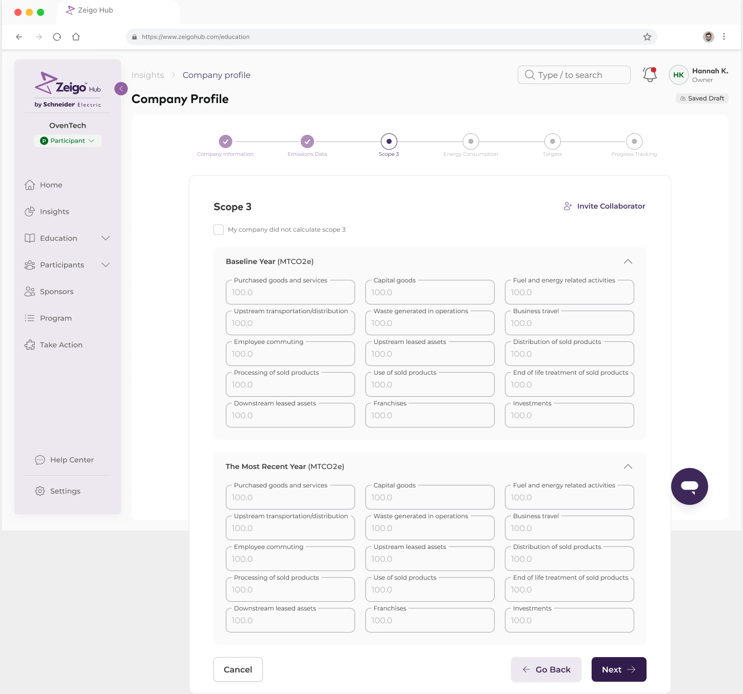
After: 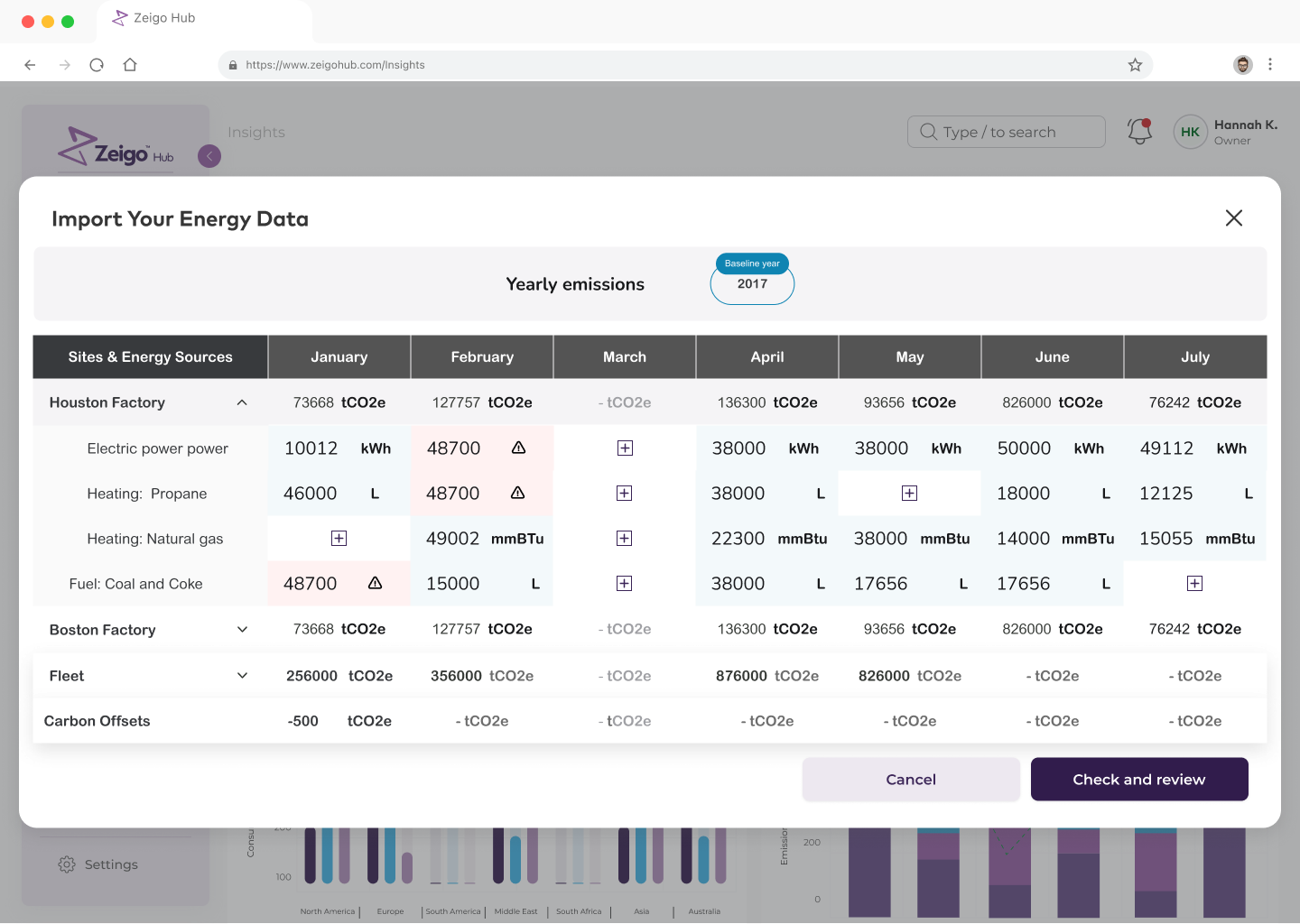
Nobody asked me to fix onboarding. I was reading the funnel in **Mixpanel** and saw where it broke: the data steps. About two thirds of the suppliers who reached them left without finishing. I brought the funnel to the team and proposed the import.
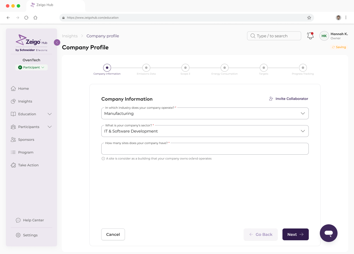
The form already had autosave and an Invite Collaborator link. That tells you something: people were leaving mid-way and handing it to someone else. **Scope 3 alone is 15 categories across two years.** Energy Consumption asks electricity, steam, heat and cooling per year plus every region you operate in.
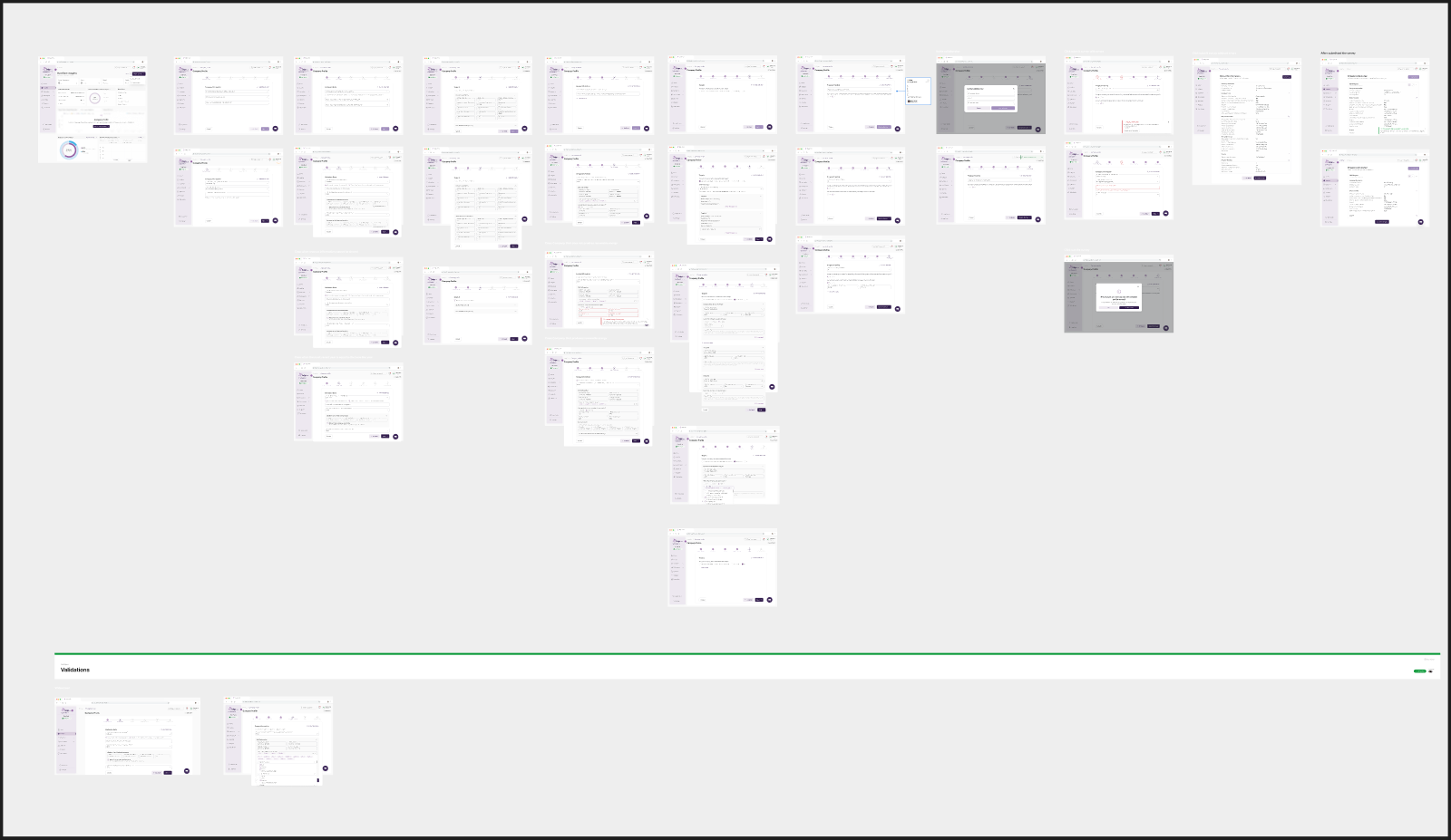
The hypothesis was simple: suppliers already have this data in a spreadsheet. If they can hand us the spreadsheet, most of the drop disappears. I ruled out shortening the form, because the fields are regulatory; saving progress and nagging by email, because it treats the symptom; and integrating with each supplier's accounting system, because there are thousands of suppliers and no common system. The spreadsheet was the one thing everyone had.
---
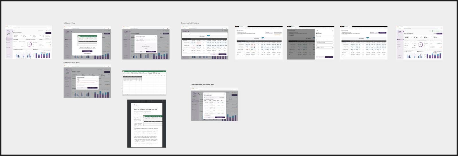
The decision that made it work was to design **one data structure** and make three things speak it: site, energy source, period, amount, unit. The template suppliers download has exactly those six columns. The parser in the browser maps the upload into that shape. The table renders that shape. The backend only ever receives the shape, already confirmed.
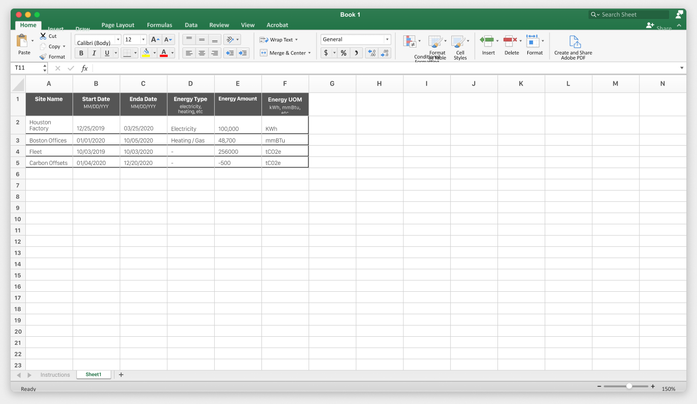
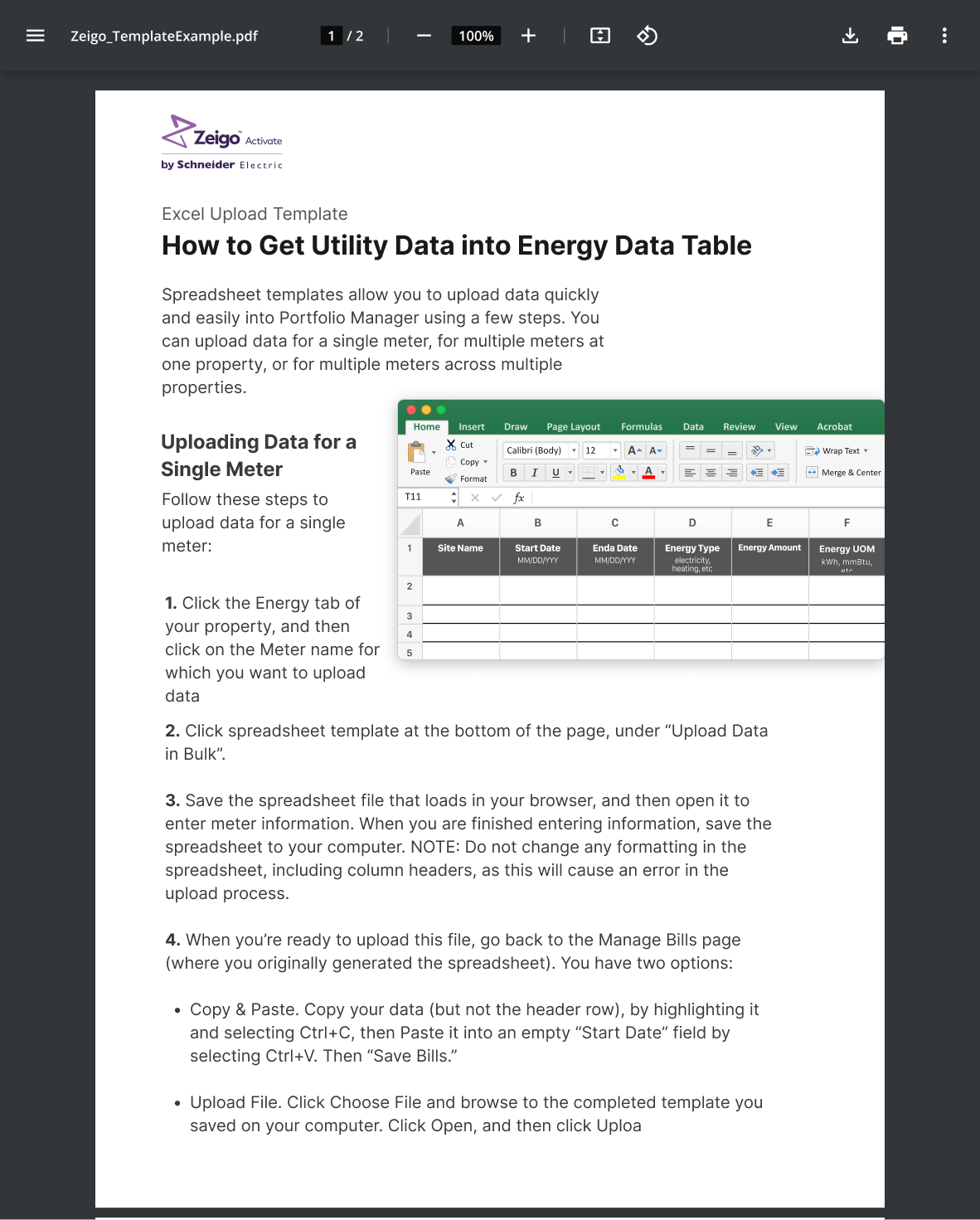
The import was born in **Zeigo Activate**, where sites already reported energy by source and month. The instructions PDF still carries the Activate logo. When HUB's survey showed the same drop, I brought the pattern over instead of designing a second one.
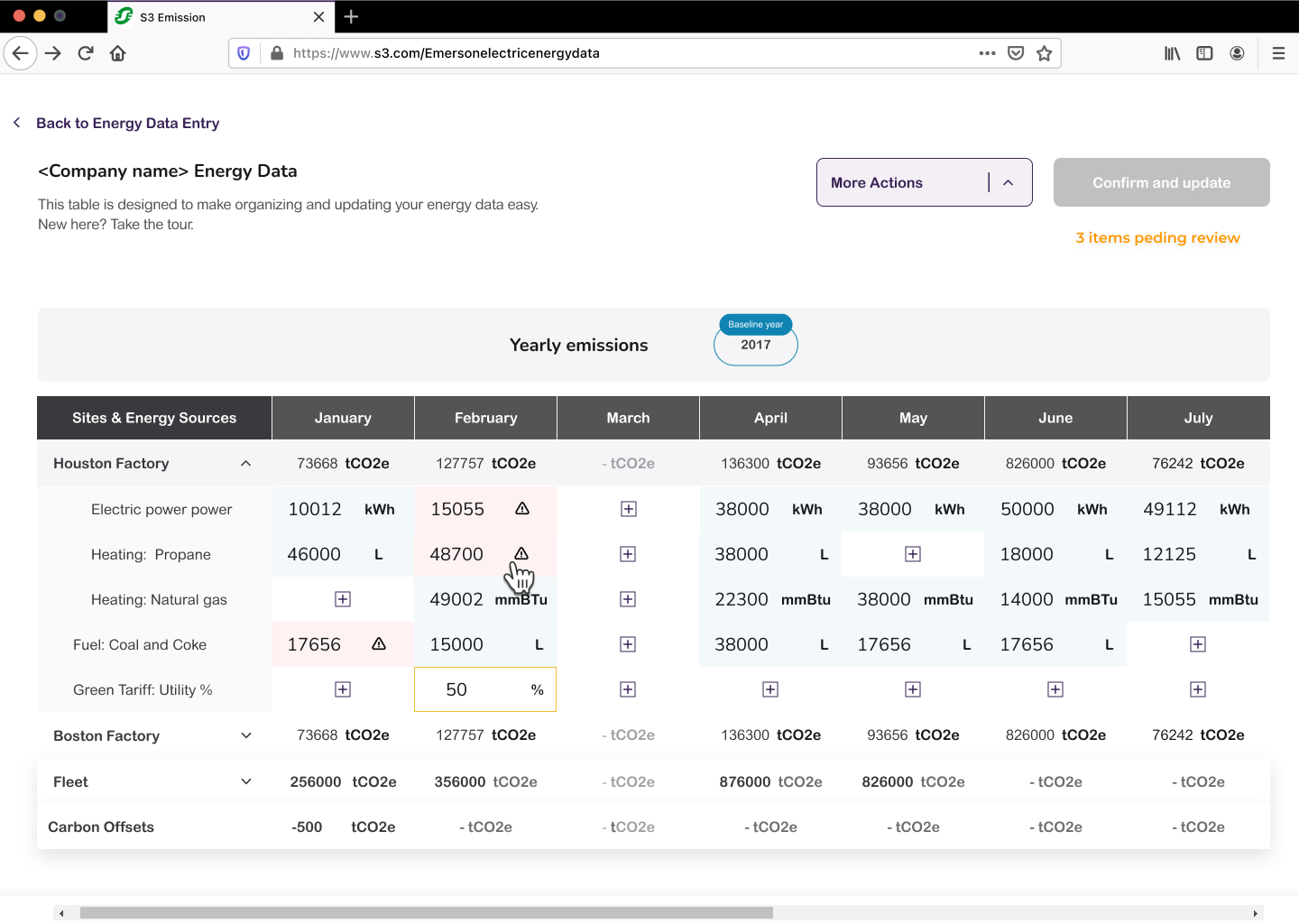
Real files are never clean. Users in the US wrote 1,000.5; users in Europe wrote 1.000,5. Some left units inside cells, some mixed periods. Instead of rejecting the file or silently normalizing it, the upload lands in a **review table**. Doubtful cells are tinted and marked. Empty cells show a plus. The header counts what is pending, and Confirm and update stays disabled until that count is zero.
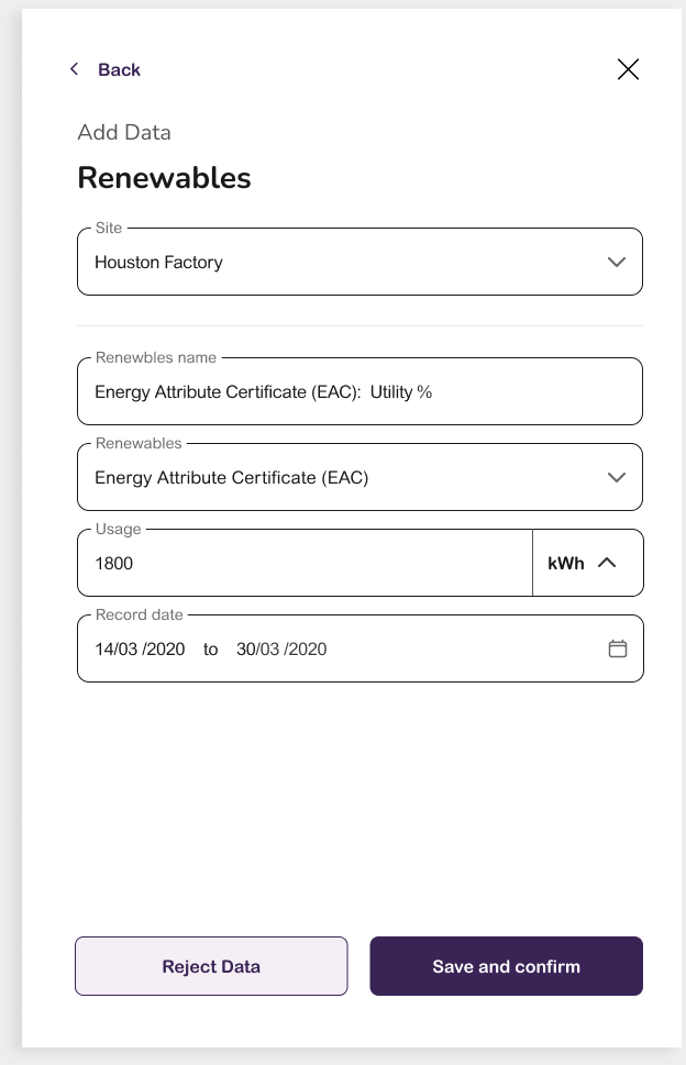
Clicking a flagged cell opens the parsed values with two buttons: **Reject Data** or **Save and confirm**. The data is populated in the interface but nothing is sent until every item is confirmed. A designer alone would have shipped an upload that fails and asks you to try again. An engineer alone would have normalized server-side and lost the user's trust the moment a comma turned into a thousand-fold error.
---
I built the first version as a **code prototype with Claude and Cursor**, wired to the real template, in about a week. Fast enough to measure instead of debate. We put it in front of real suppliers with Mixpanel for completion and **Clarity** recordings for where they hesitated. The first version trusted the file. Users broke it in a day with commas, decimals, units and regional formats. That is where the review layer came from.
I opened the PR. The HUB engineers adapted it to their conventions and it shipped with small changes.
- Suppliers completing the data steps: 35% → 70%
- Time to enter one company: 45 min → 5 min
- Uploads with a format issue caught before the backend: 0 → 40%
- Steps to type by hand: 6 → 1 upload
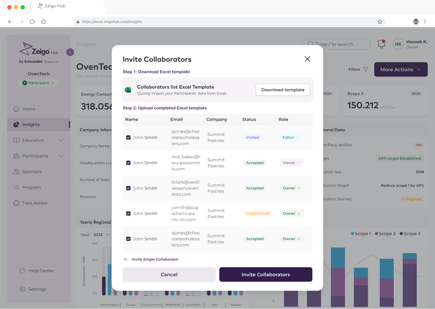
The structure outlived the feature. The same template, upload, review-rows pattern was reused as-is for **Invite Collaborators**: download a template, upload it, rows with a status. And every Zeus component HUB needed along the way went back into the system.
What I'd do differently: ship the validation layer in the first prototype. Real user data is never clean. I knew that and still tested the happy path first.
> "Working with X has been great. He is reliable and fast. The solutions he designs are creative and empathetic to the end-user experience!" — Stefanos Bezanis, Senior Product Manager, Zeigo (Schneider Electric)
### 2. Zeus Design System — Schneider Electric (2022 → 2026)
[Shared Library](https://zeigo-network-library.vercel.app/)
Context: We built **Zeigo Activate from scratch**, and instead of building one product we built a design system and let the product fall out of it. The only inherited material was a legacy palette of **118 color values** named after the one place each was used.
My role: I designed the Zeus components in **Figma**, wrote them in **React and TypeScript**, and documented them in the Shared Library: about 45 component sets, 22 documented components, 8 token families, maintained in Figma and code at the same time. Other designers and engineers built the products on top of it; the system itself, across all three layers, is mine.
Impact: Three products, Activate, HUB and Network, ship on one component set. When HUB came, **~70% of its screens were assembled from Zeus** without designing or coding a new component, and a new screen went from Figma handoff to merged PR in **3 to 4 days instead of 2 weeks**.
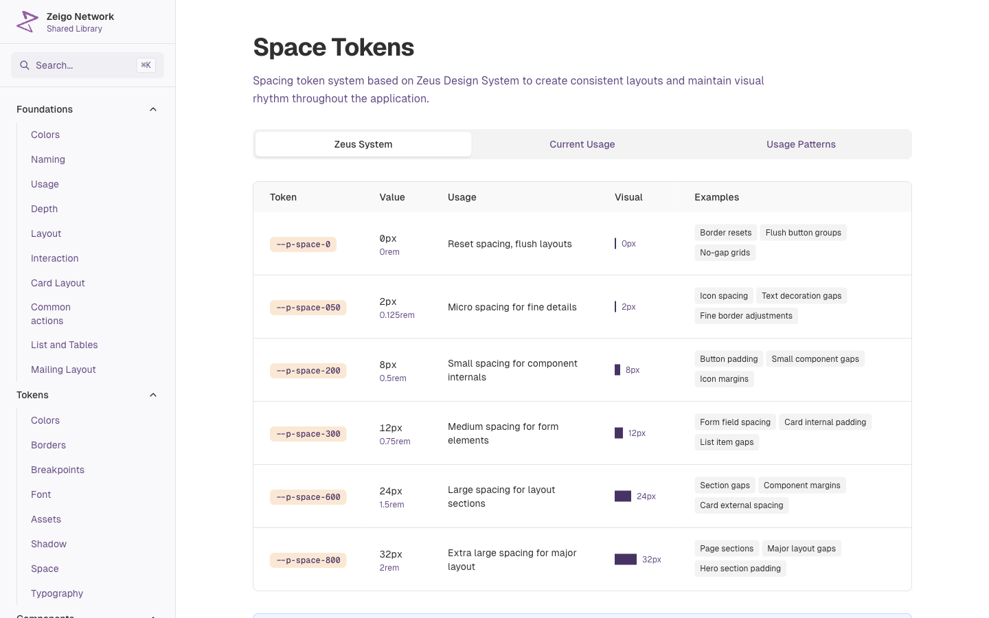
We built Zeigo Activate from scratch. Instead of building one product, we built a design system and let the product fall out of it. That is Zeus: about 45 component sets in Figma, 22 documented components, 8 token families, maintained in Figma and in code at the same time. When Zeigo HUB came two years later, most of its screens were already designed.

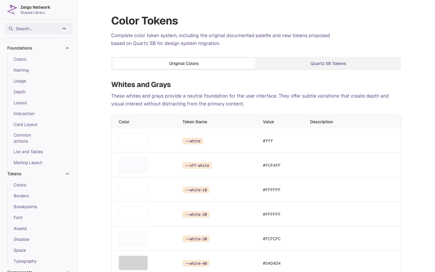
The only thing we inherited was a palette. **118 color values in 9 groups**, named after the one place each was used: dark-gray-410 textbox normal state, dark-gray-510 textbox hover state. The Shared Library still documents it as Original Colors, next to what replaced it.
A small team, 2 to 3 designers and 4 to 6 front-end engineers, and every screen re-deciding the basics: which gray, which radius, which spacing. Two or three review rounds per screen on things that should have been settled once. The usual path is build the product first, extract the system later. That path is how you get 118 grays.
---
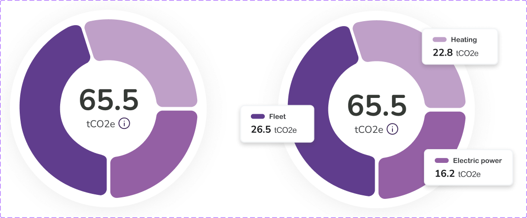
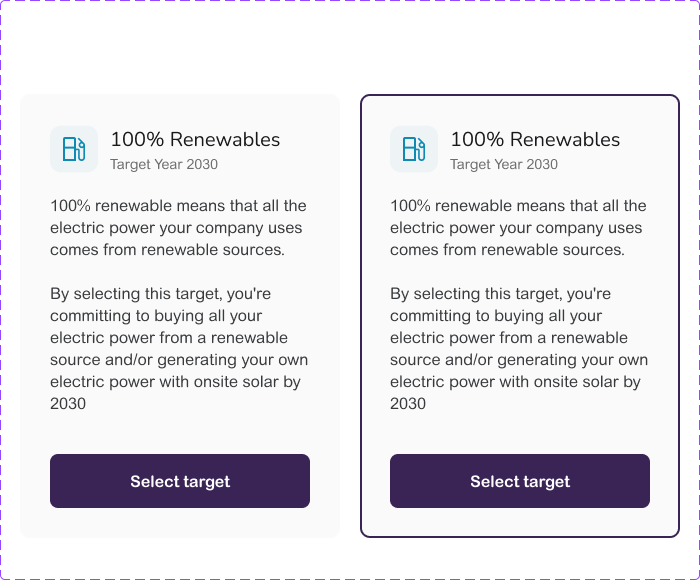
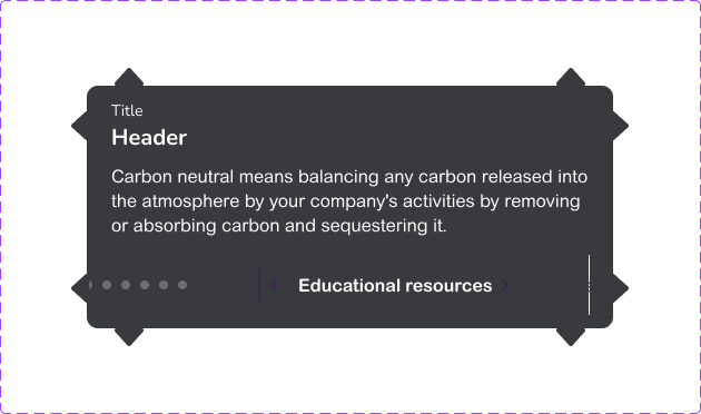
The decision was to make **tokens the contract between Figma and code, not components**. Semantic surface and text tokens, background-page, layer-01 to layer-03, text-standard, text-subdued, text-inverse, plus scaled tokens for space, type, radius and elevation. Named once, published as Figma variables and as CSS custom properties, consumed by every component on both sides.
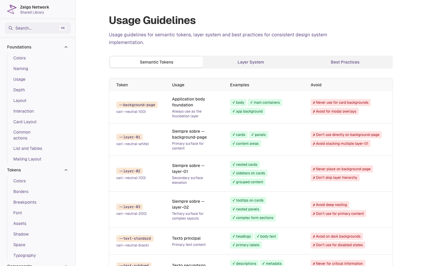
Naming a layer system so it survives as CSS is an engineering constraint. Prefix plus scale, ordering rules like layer-02 always sits on layer-01. A designer alone misses it, and the palette stays at 118 hand-named values. The hierarchy itself, the avoid deep nesting rule, the accessible contrast for data-dense emissions screens, those come from design. An engineer alone ships a flat palette and a div with a shadow.
---
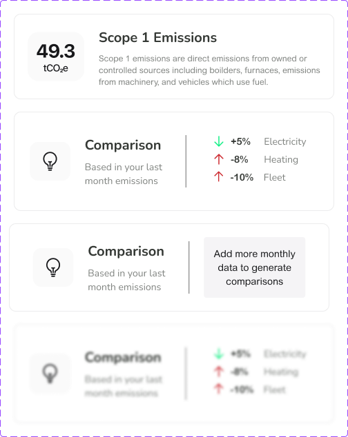
Three products had to ship on one component set, so brand could not live in components. It lived in tokens and in **one logo component** with a variant per product: Zeigo, Power, Network, Activate, Hub. That is what made the later integration into HUB and Network possible without forking.
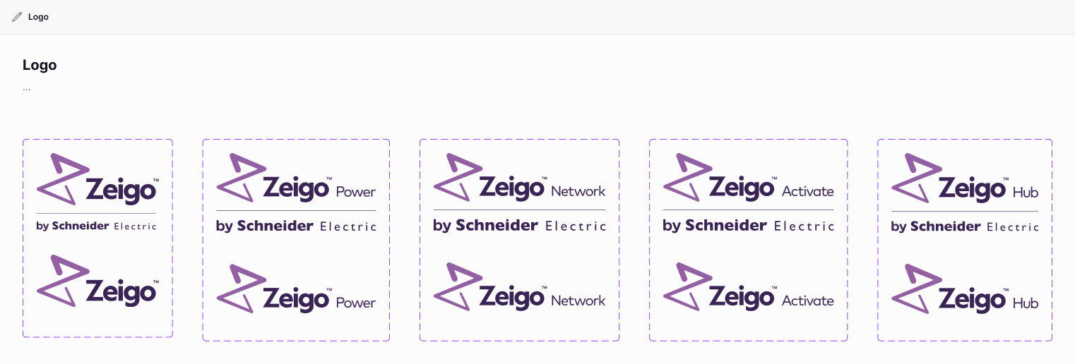
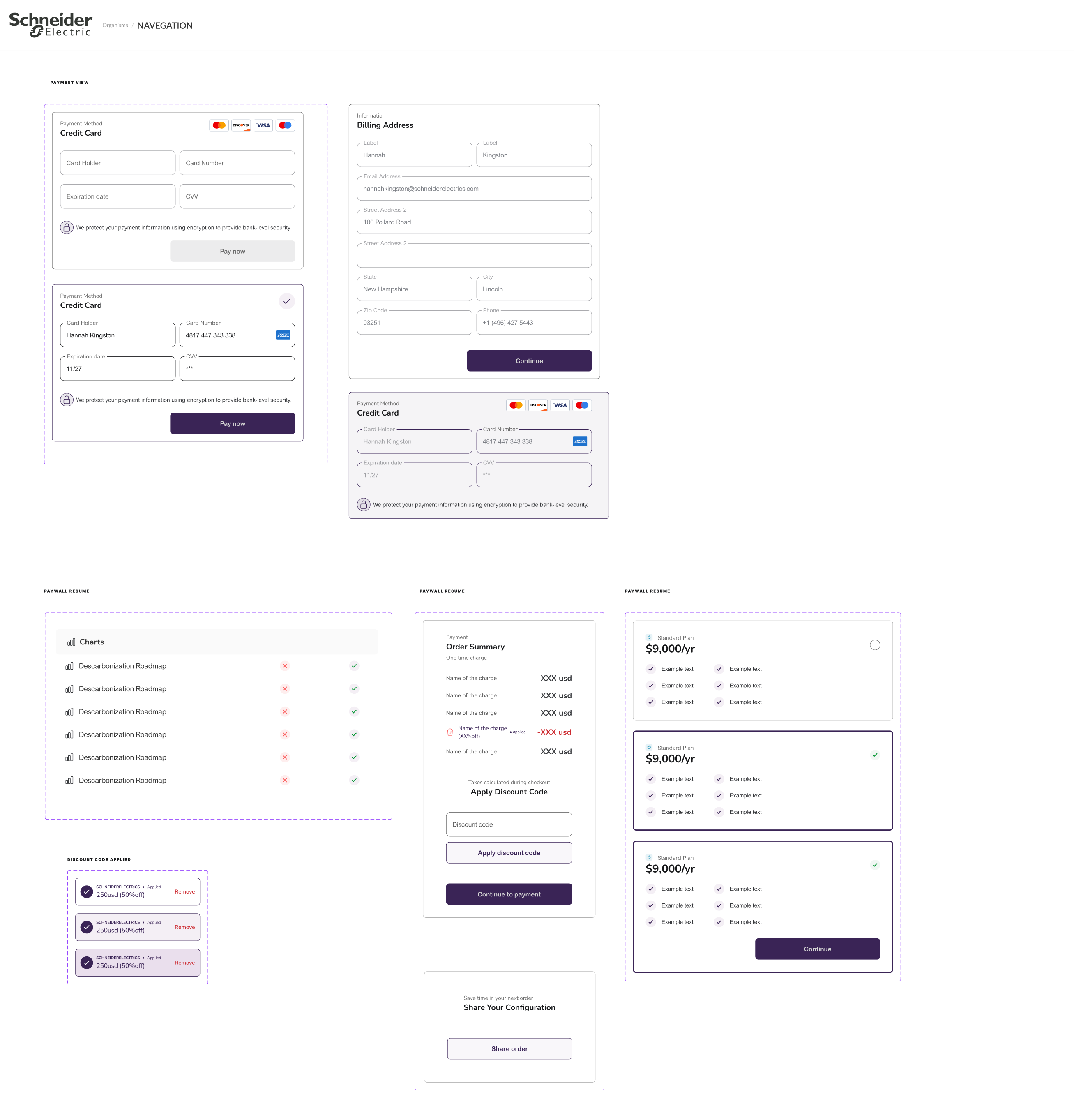
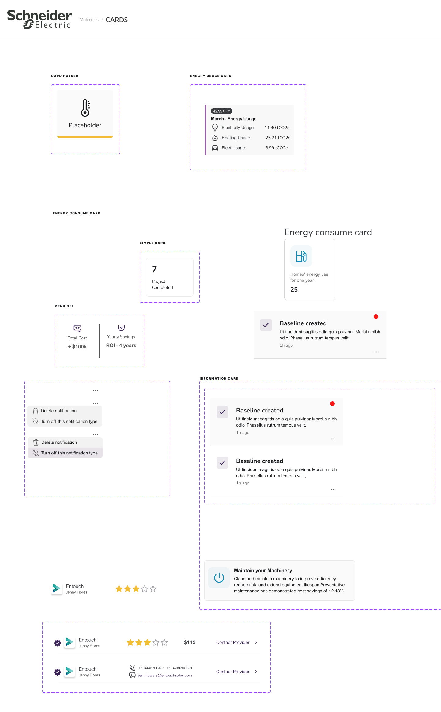
What broke when Zeus moved from Activate into HUB: the brand color and logo per product, and a handful of card sizes for data-dense tables. Exactly the things that became the logo component and the layer tokens.
---
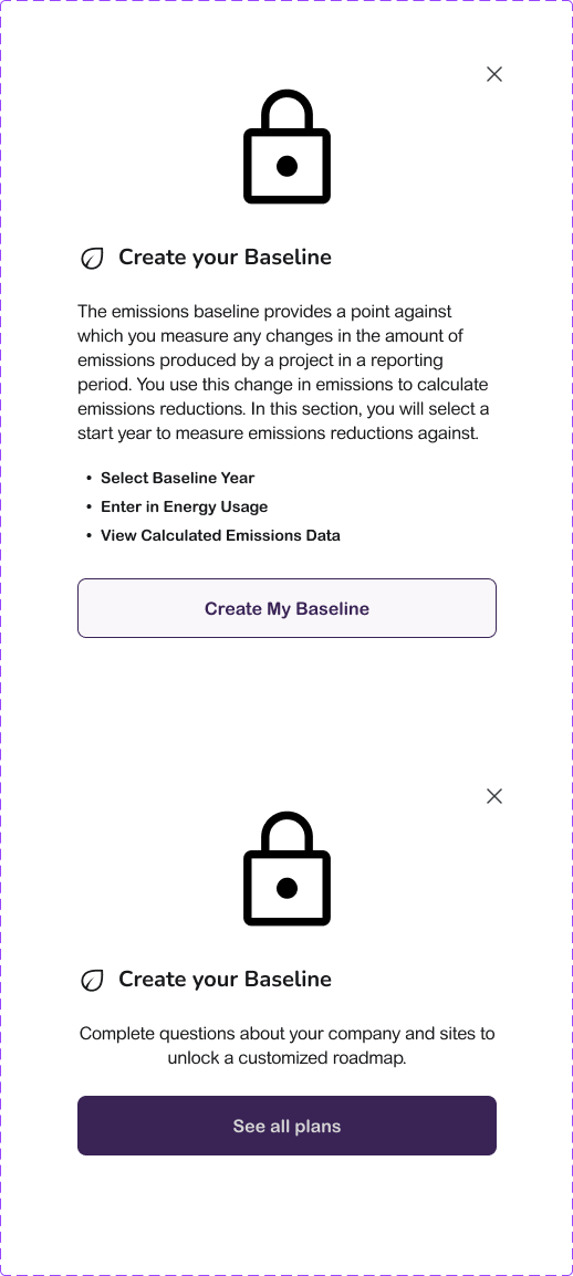
Before a component entered Zeus I prototyped it in code, to expose the states Figma could not: hover, loading, empty, error, long content, locale formats. **Site Card** is the example. Figma had two states. The code prototype, fed with real supplier data, needed created, selected and hover combinations that changed the layout. The Figma set grew to seven states from what the prototype showed, not the other way around.

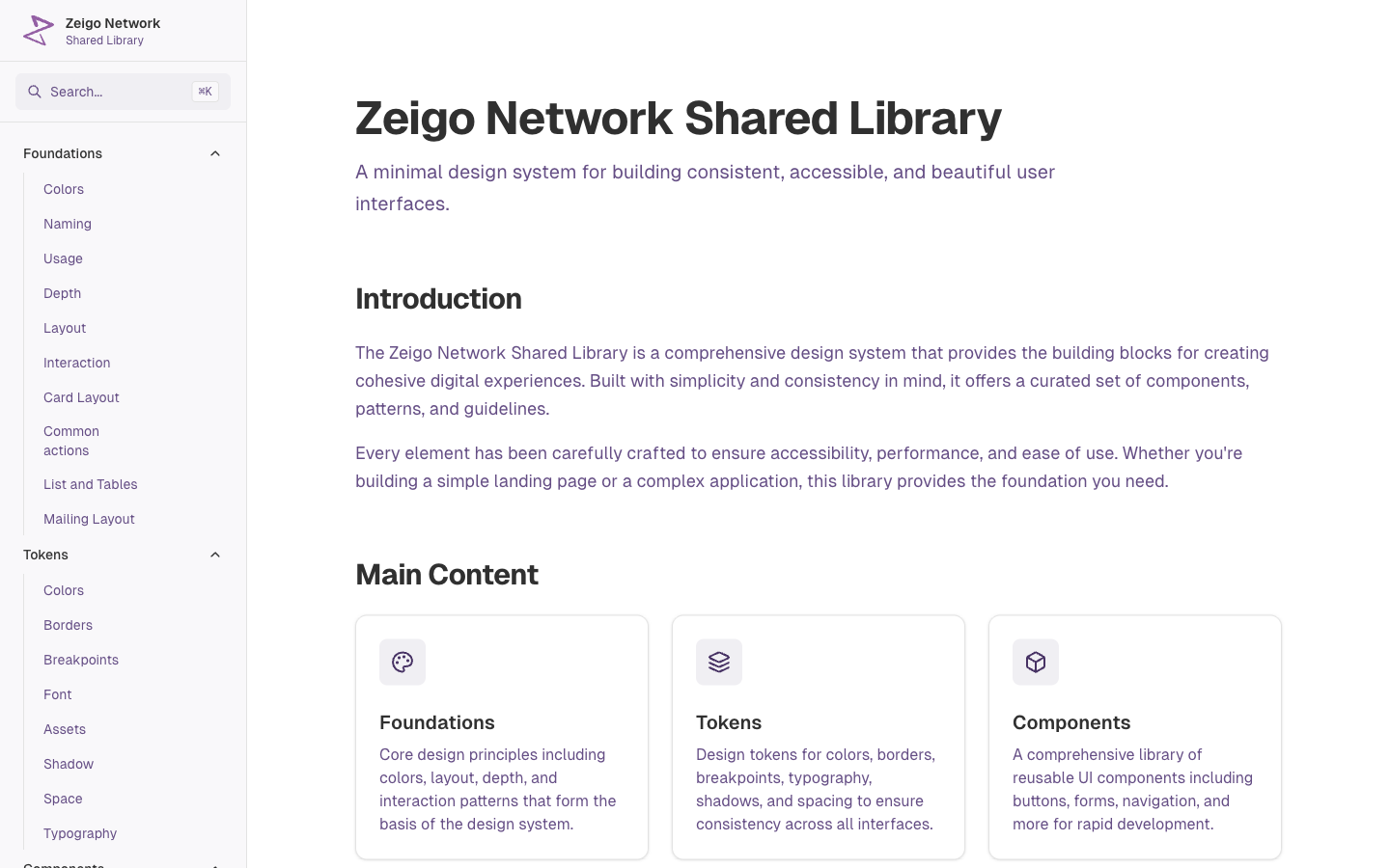
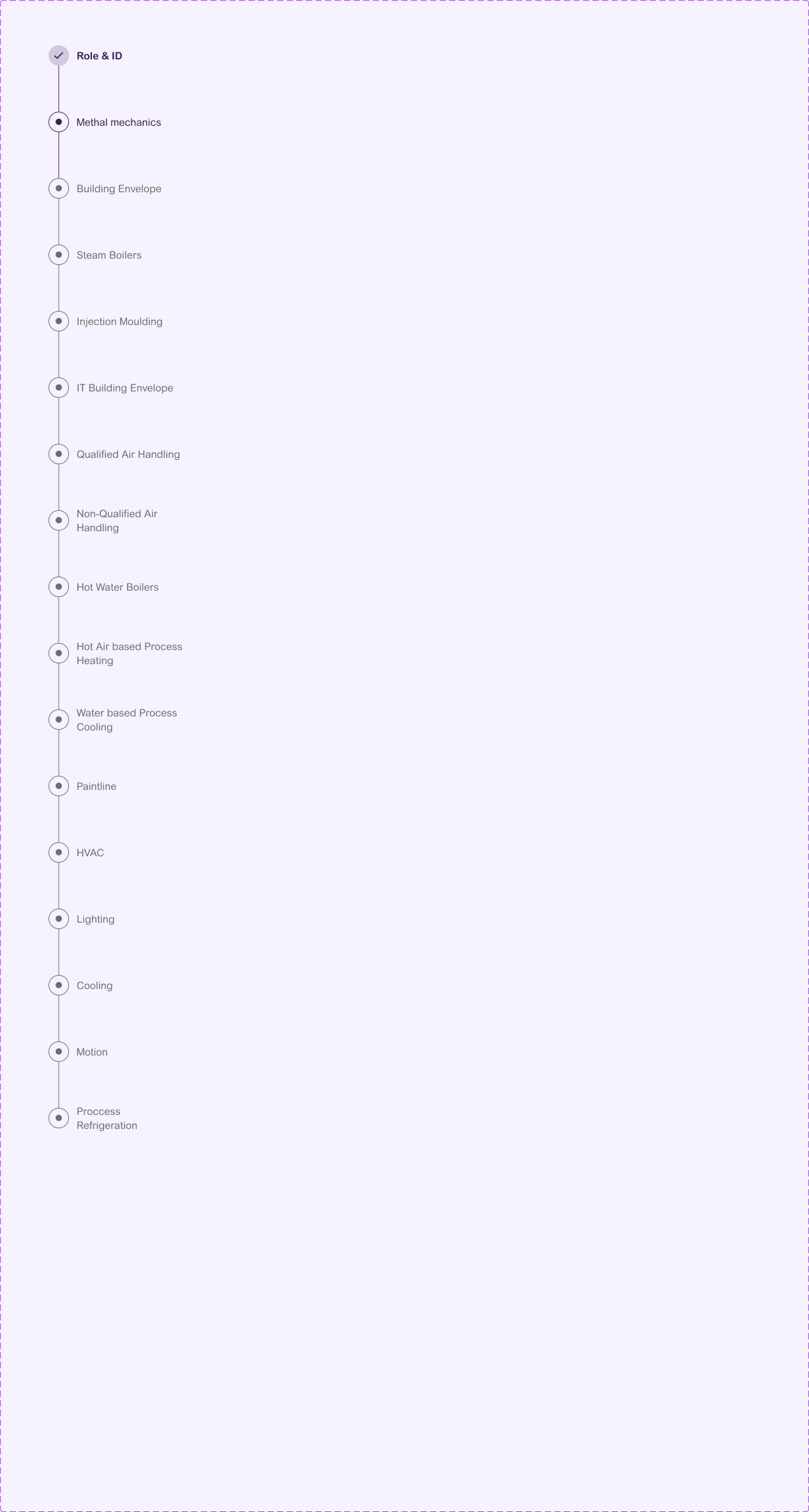
Designer reviews happened in **Storybook** rather than in Figma, so the review was on real states. Figma branches for design changes, Git branches for code changes, merged in both. The Shared Library carries a Complete or In progress badge per page, so nobody consumed an unfinished component by accident.
---
- Color tokens in daily use: 118 → 7 semantic
- Products on one component set: 1 → 3
- HUB screens built without a new component: 0 → 70%
- Figma handoff to merged PR, new screen: 2 weeks → 3–4 days
- Design review rounds per component: 2–3 → 1
What didn't work: 15 of the 22 documented components are still marked In progress. Documentation lagged behind code once HUB started pulling the team's time. If I did it again I would document at the same pace as I code. What stayed: Zeus V.2, the token set, the library, the Storybook. Three products still ship on it.
> "Working with X has been great. He is reliable and fast. The solutions he designs are creative and empathetic to the end-user experience!" — Stefanos Bezanis, Senior Product Manager, Zeigo (Schneider Electric)
### 3. Zeigo Activate — Schneider Electric (2024 → 2025)
[Product walkthroughs](https://www.youtube.com/playlist?list=PLsSa2oaki_7LOYqqEVOywewpN5r8EXqnn)
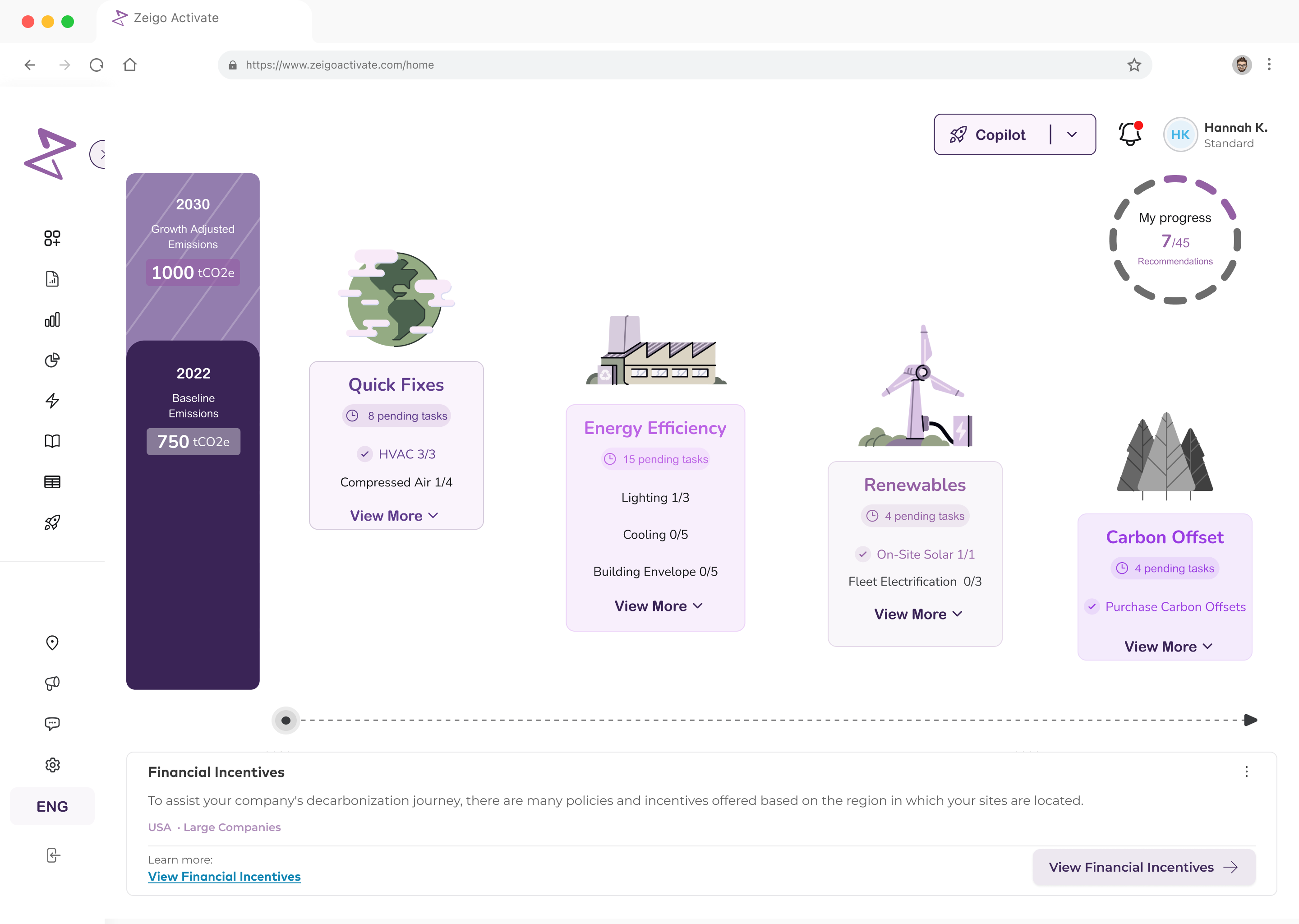
Context: Getting a decarbonization roadmap meant hiring a consultant and waiting weeks. Activate is a subscription product that asks a company about its sites and energy systems and **returns a dated roadmap**: projects, costs, savings and a projection of its own emissions to 2030.
My role: I was **design lead**. I designed the Plan module in Figma, wrote the Zeus components it runs on in **React and TypeScript on Next.js**, and built the data visualisation — the emissions projection chart, the roadmap timeline, the KPI row and the project tables — as PRs that merged through the team's review. I also ran research hands-on: I built the testing prototype, wrote the scenario guides and moderated sessions.
Impact: A roadmap went from **~3 weeks with a consultant to ~20 minutes self-serve**, and wizard completion from **41% to 68%**. Activate became the base the rest of the suite was built on: HUB, Power (EAC) and Network. When Schneider moved the product to freemium, the **personalised roadmap is what sits behind the paid tier**.
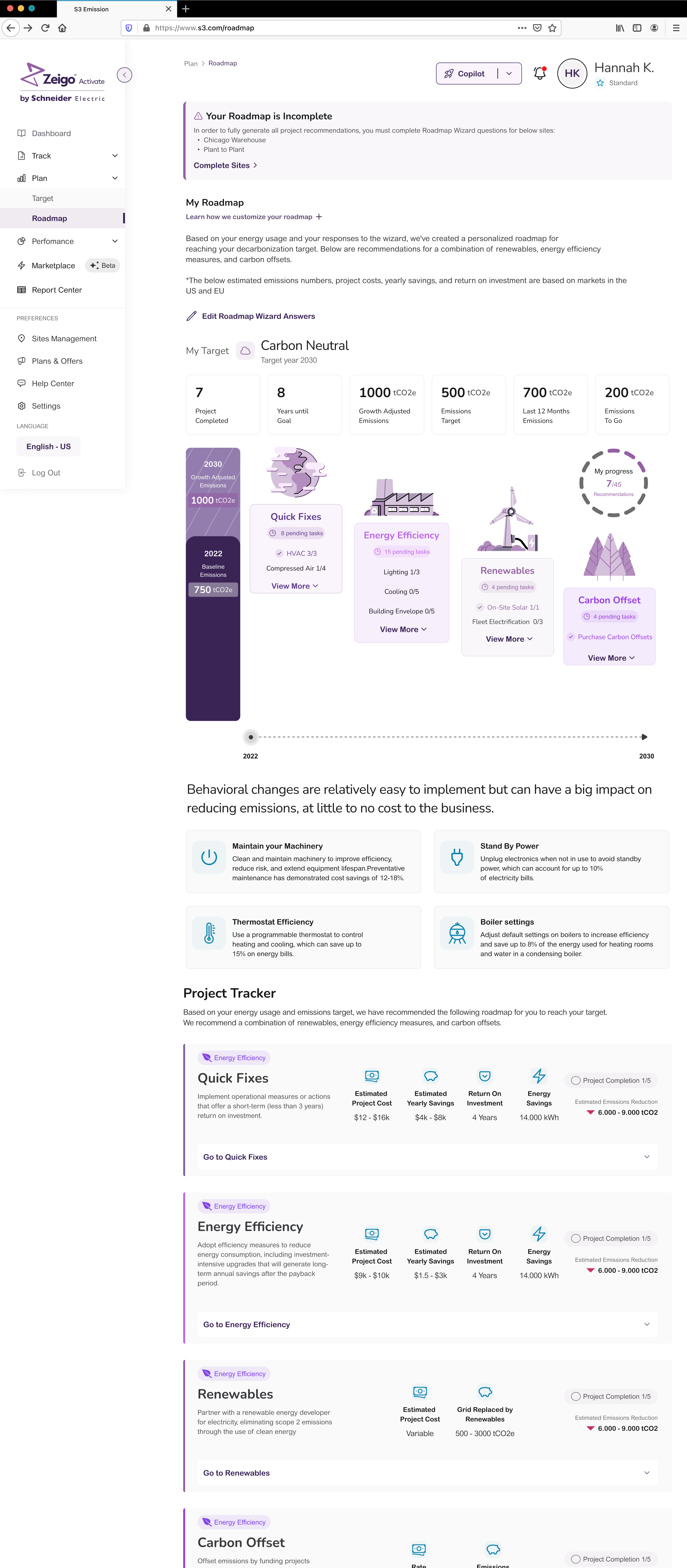
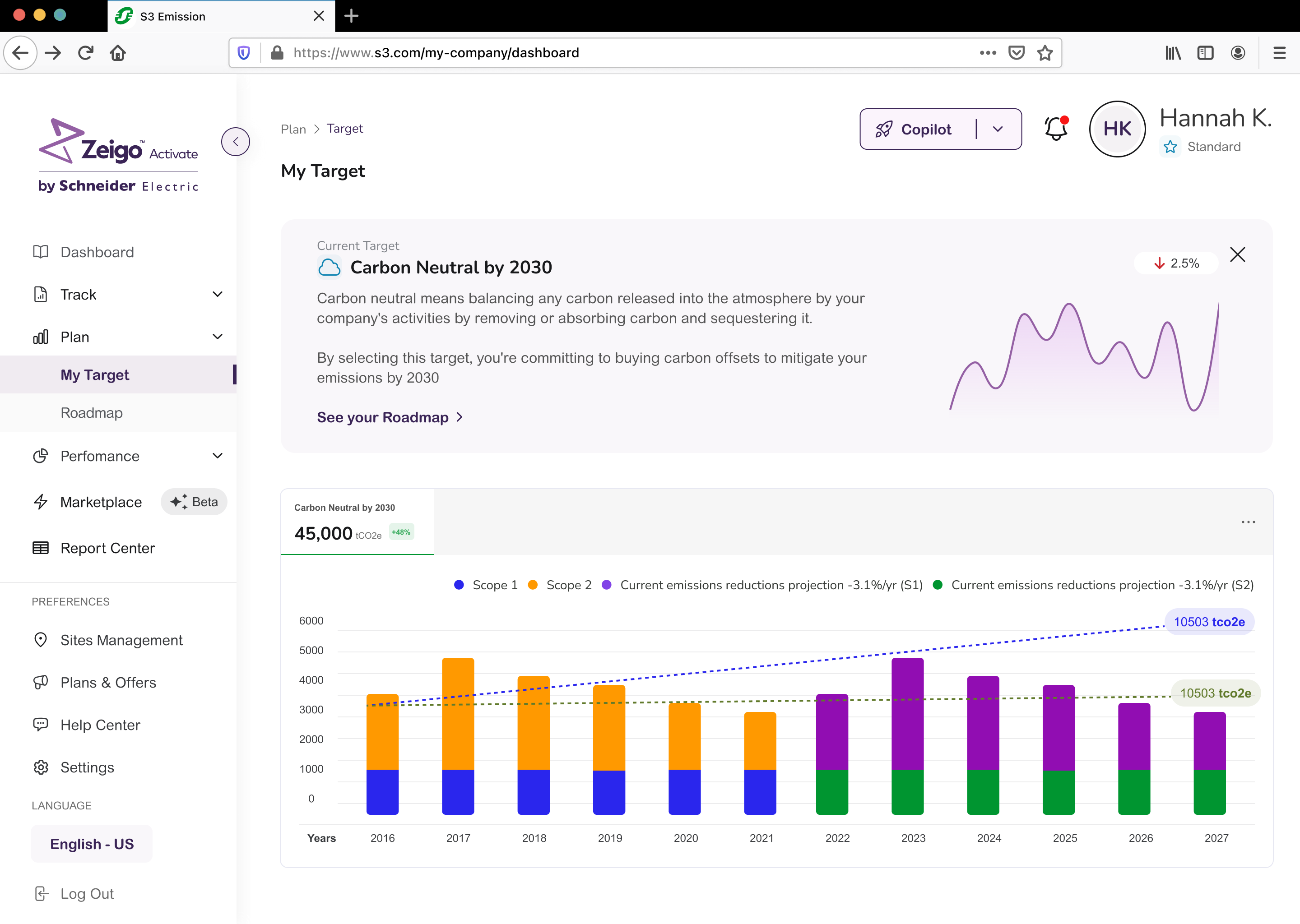
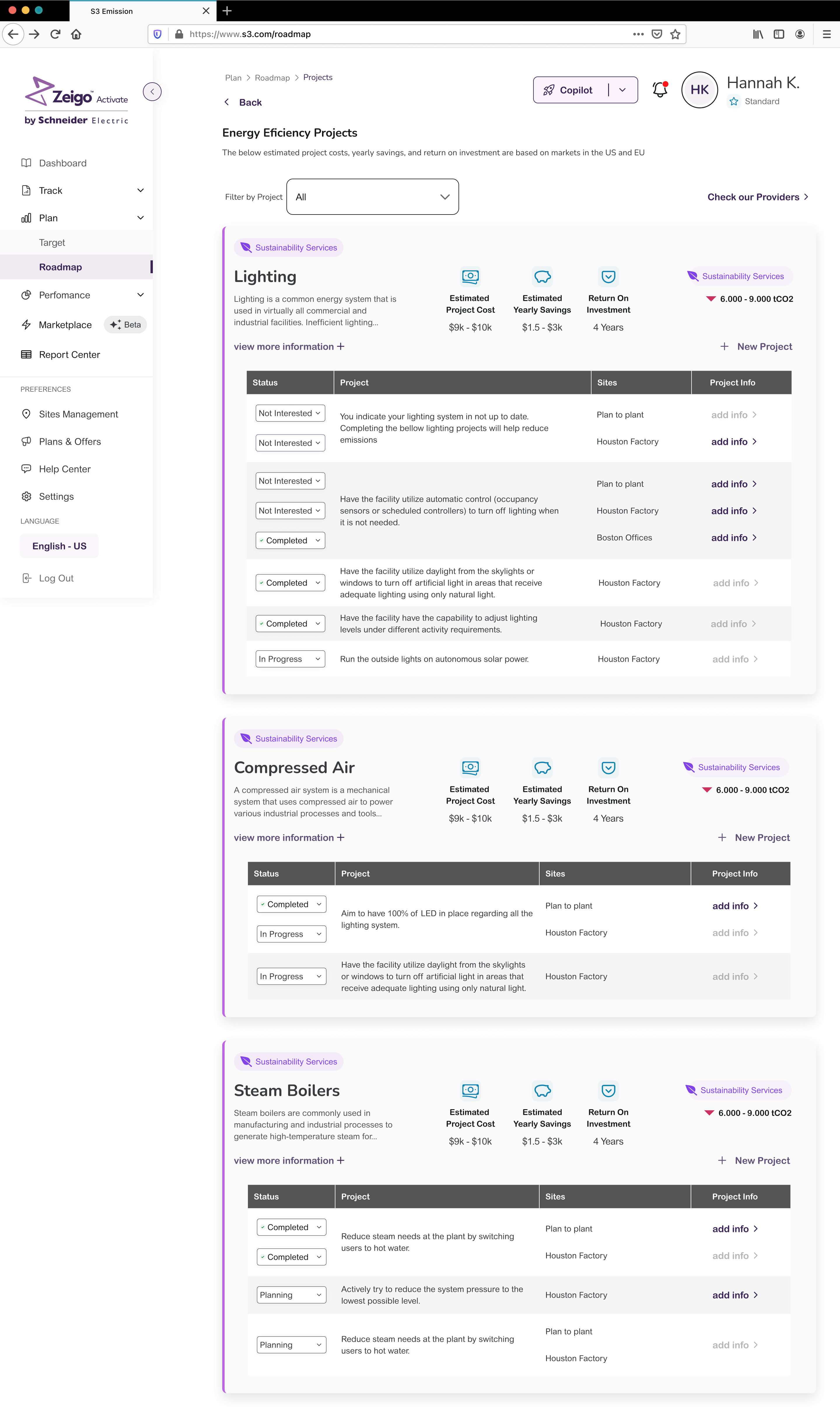
Getting a decarbonization roadmap used to mean hiring a consultant and waiting weeks for a document that went stale the moment a site changed. We turned it into a wizard: a company answers questions about its sites and energy systems, and the product returns a dated roadmap with projects, costs, savings and a projection of its own emissions to 2030.
The user is not a large enterprise. Activate reaches **small and medium companies through Schneider's channel partners** — IT resellers who sell it alongside their own offer. The person on the other side has a target and no in-house decarbonization expertise. Before the product, they exported utility invoices as PDFs, organised them in Excel and paid a third party to process the data.
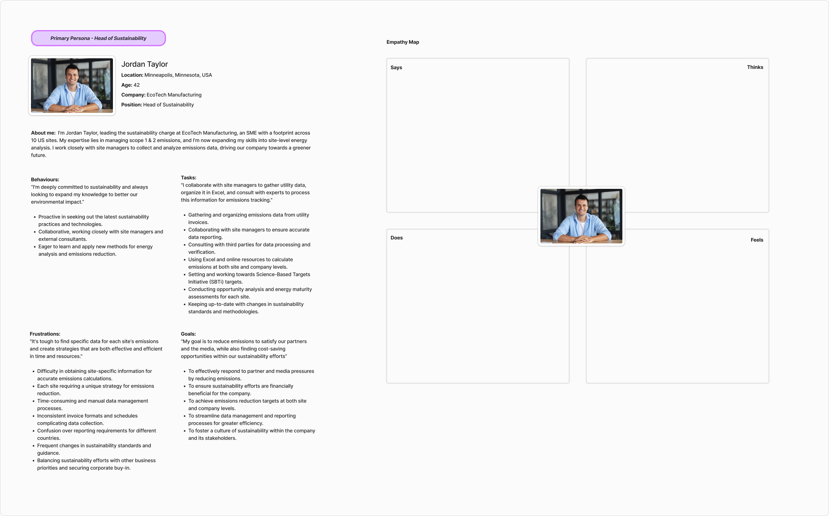
This did not start from a hunch. It started from an engagement problem written against two dated product slides: **generally not engaged with platform, missing value prop**. People were using Activate to report emissions and doing nothing with the result. They knew their footprint. What they did not know was what to do first.
---
**The decision: design the roadmap as a calculated output, not a curated list.** Every screen in the Plan module renders something the system computes from the wizard answers — which projects apply, at what cost, with what payback, and what the emissions curve looks like if you do them. I designed the UI from what the calculation could produce, and the questions from what the calculation needed.
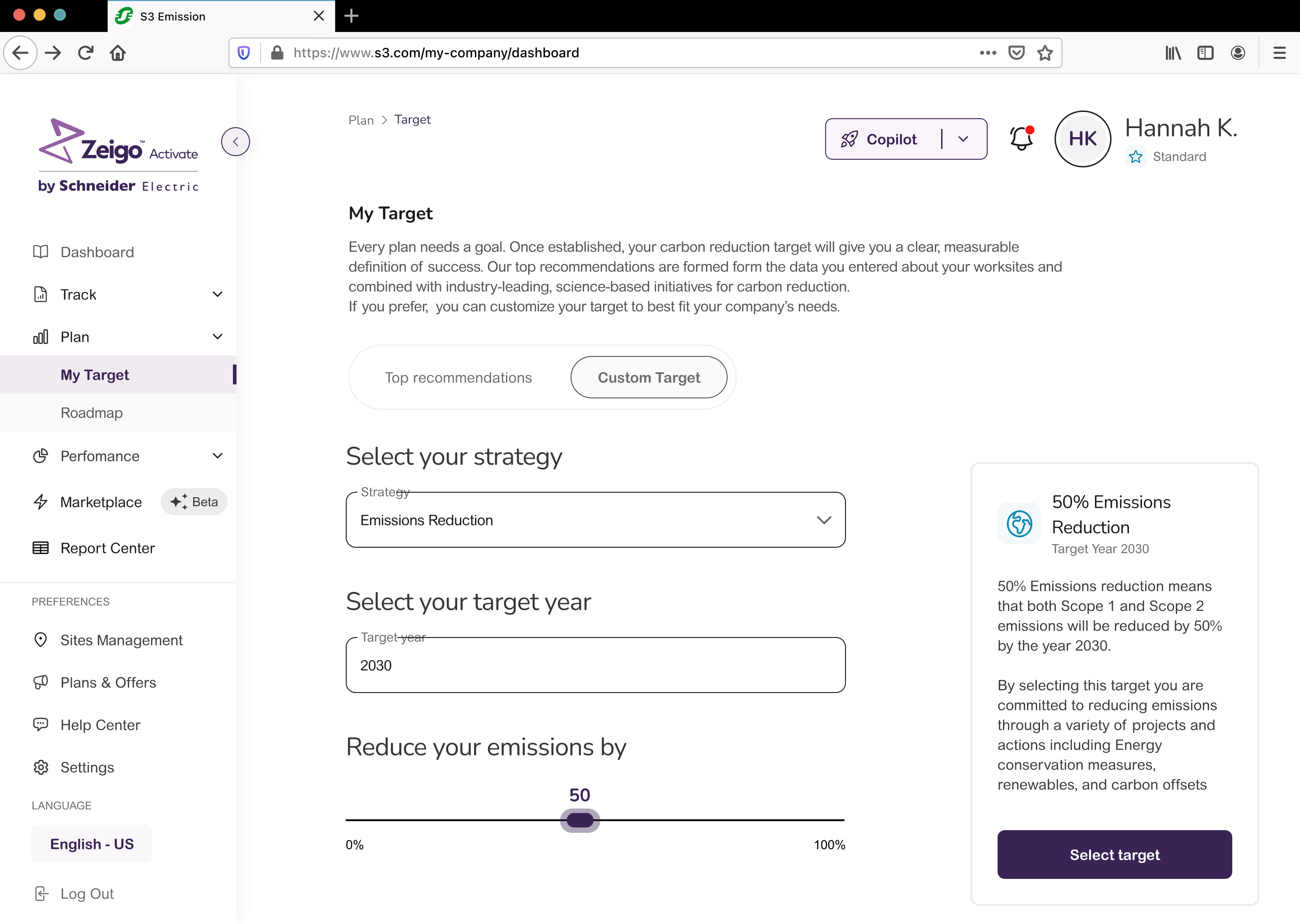
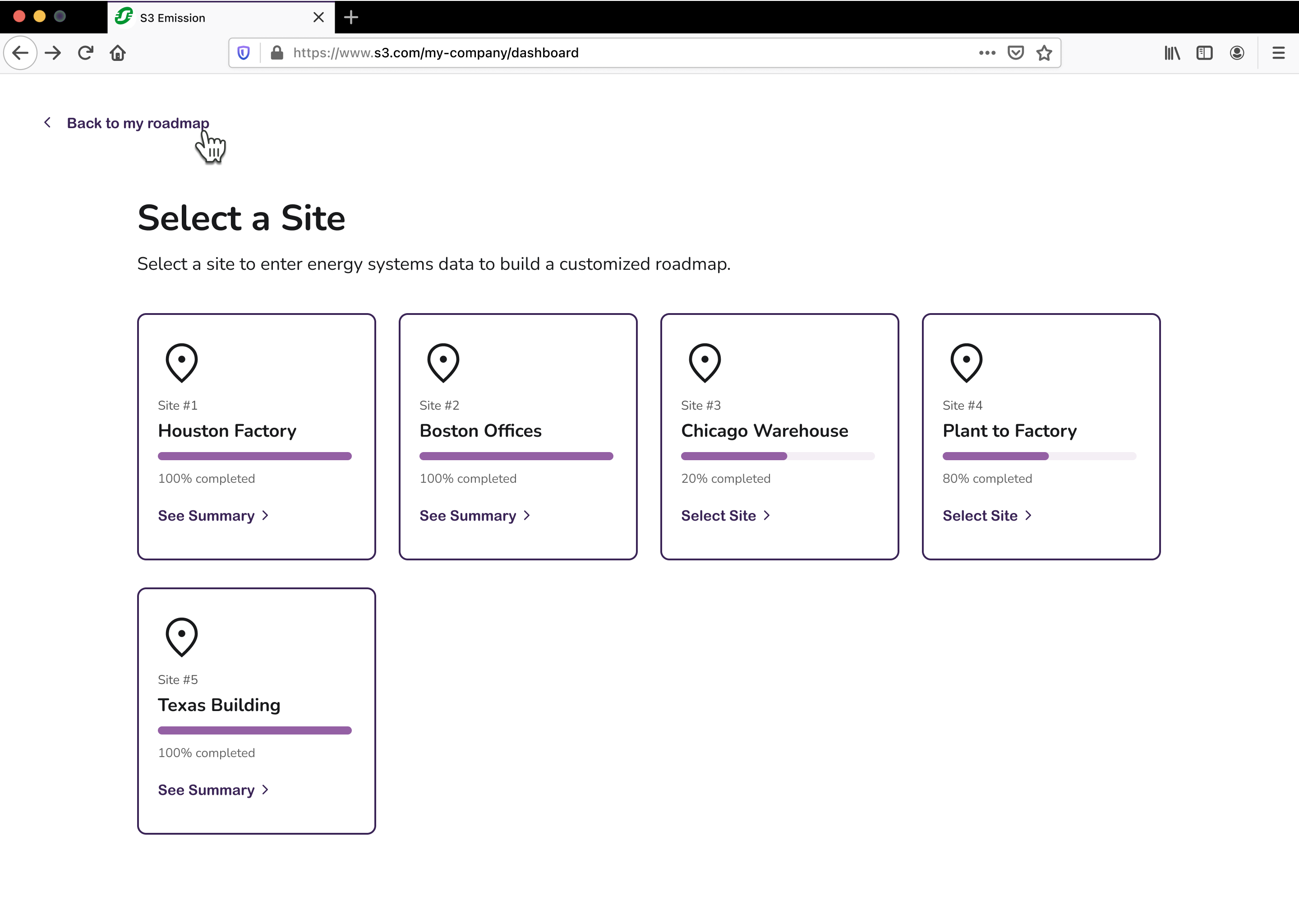
The calculation needs per-site, per-system answers, and nobody fills a 30-question survey for eight sites in one sitting. So **the incomplete state became a designed state, not an error**. The roadmap renders anyway, with a banner, and gets better as you feed it — instead of refusing to exist until the form is done.
---
A timeline with a chart, editable tables and per-row state cannot be judged in a static frame. So I built a working roadmap and deployed it, and **that prototype became the testing instrument** — every research guide points at it. We ran numbered experiments on a written pipeline: research guide, prototype, tests, analysis, insight report, user stories, sprints.
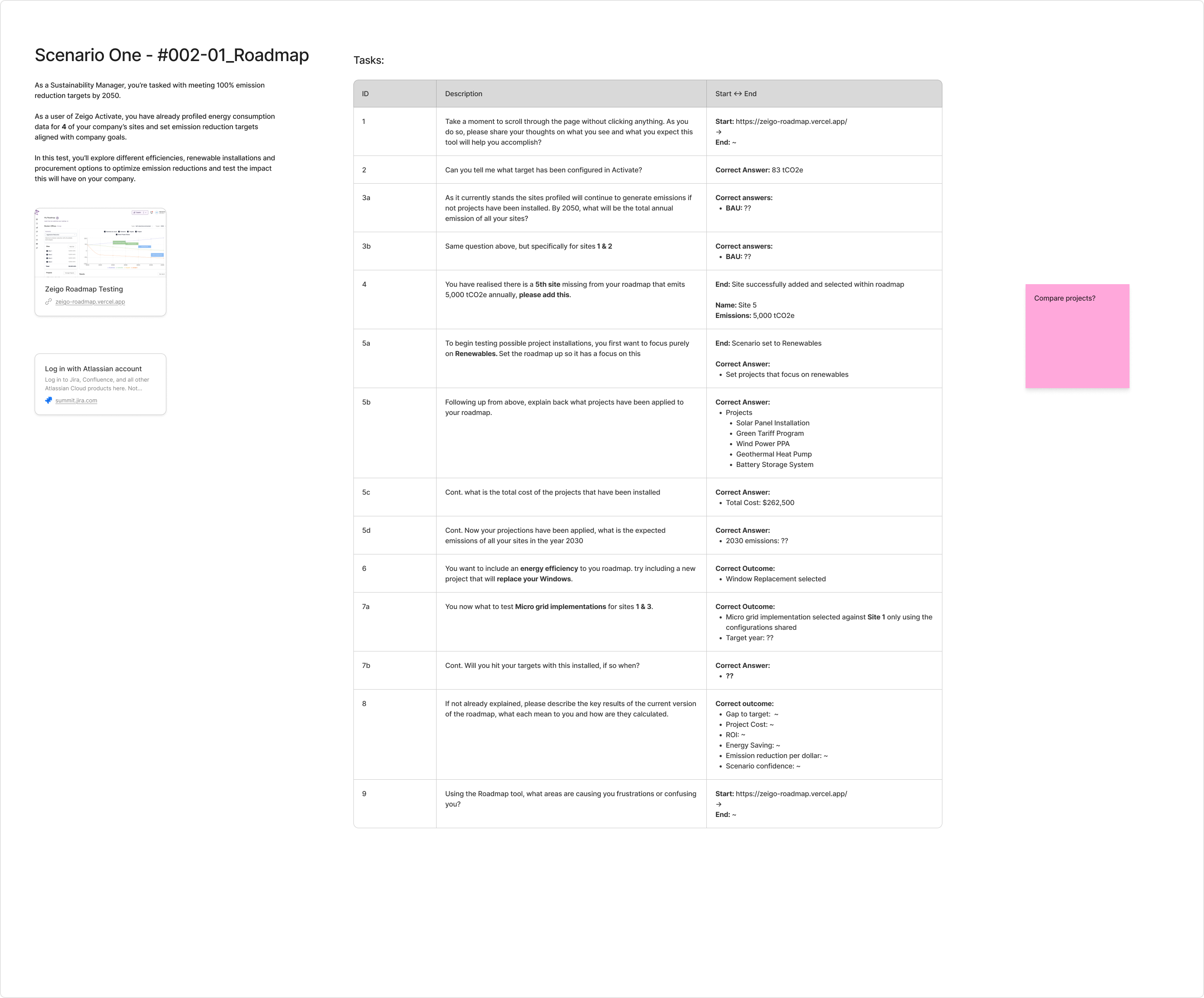
Navigation held. People read left to right, hit the business-as-usual number without friction, and recognised the design consistency with other platforms — free validation of Zeus. **What broke was the reading of the data.** The chart was not self-explanatory: people hovered over lines to guess units. Nobody could tell whether *gap to target* meant time or emissions. One tester could not find the microgrid project and added it as a custom project instead.
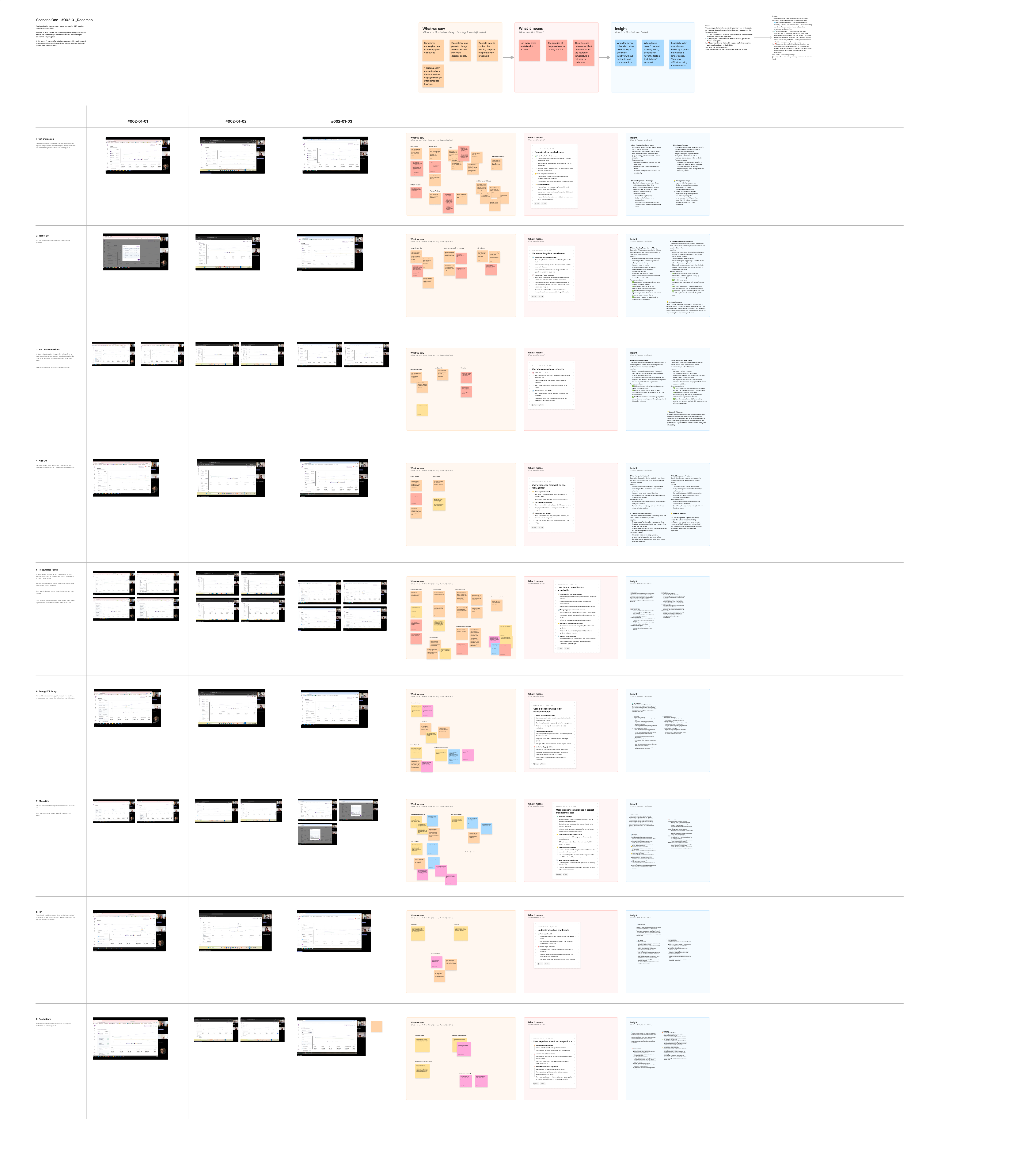
So the work moved from adding features to **making the calculation legible**: explicit axis labels and units, tooltips per KPI, an unambiguous definition of gap to target, visual separation of categories from projects. And an earlier round of client sessions had already pushed the biggest change of all — the roadmap stopped being a document and became a **tracker**, with a status on every project at every site.
- Time to a first roadmap: ~3 weeks → ~20 min
- Roadmap wizard completion: 41% → 68%
- Products built on its foundation: — → 3
---
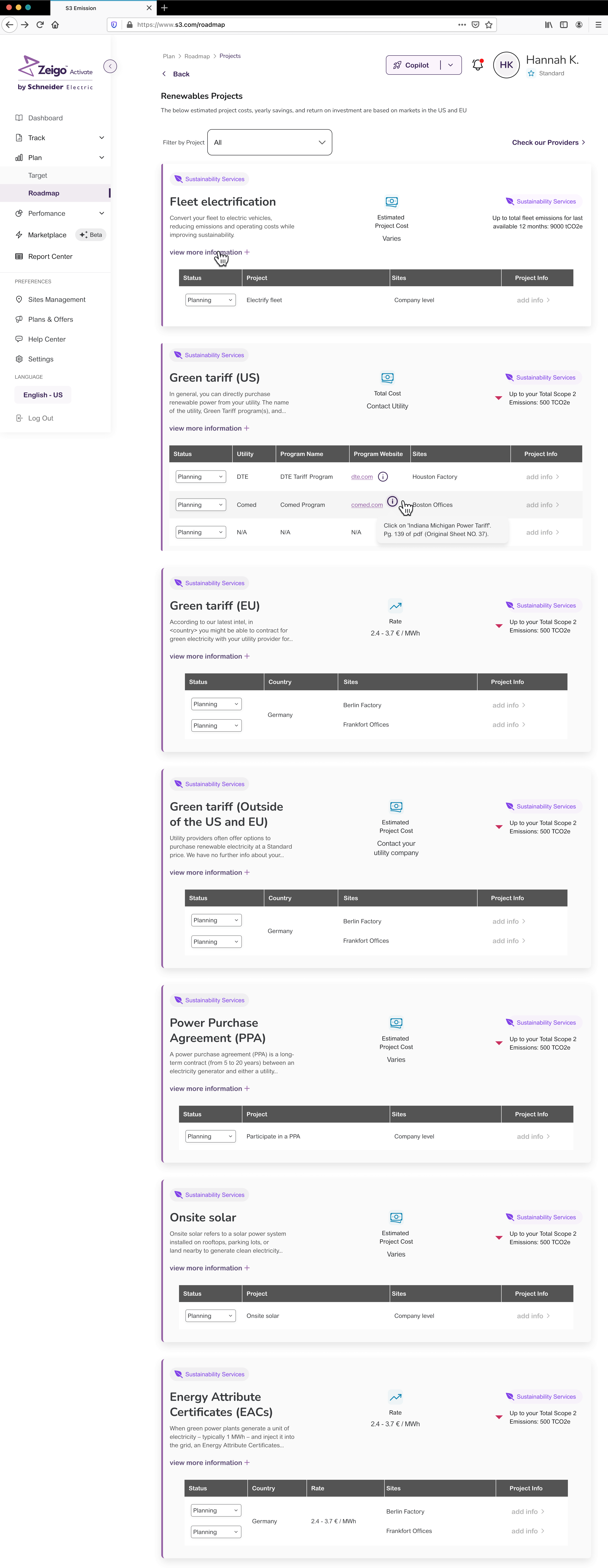
The Renewables page is where Activate hands a company over to the next product. Green tariffs, PPAs, onsite solar and **Energy Attribute Certificates** — which is what Zeigo Power exists to trade. Same suite, two ends of one journey.
**What I'd do differently:** build the roadmap as an editable object from day one. Everything the redesign added — removing projects, comparing impact, tracking progress — is agency we retrofitted onto something that started read-only. The client sessions told us that in the first year; the architecture took until the second to allow it.
> "Working with X has been great. He is reliable and fast. The solutions he designs are creative and empathetic to the end-user experience!" — Stefanos Bezanis, Senior Product Manager, Zeigo (Schneider Electric)
### 4. Zeigo Power — Schneider Electric (2025)
Context: Buying renewable energy certificates as a group means dozens of companies committing volume against one price, in a window that closes on a date. Closing one of those trades was **an email thread and a spreadsheet**. Zeigo Power is the console that does it in product.
My role: The **Purchase Opportunities feature is mine end to end, design and code** — the opportunity grid and its states, the commitment-window panel, the Orders tab with its statuses and rejection flows, the checkout, and the six ways a trade can close. Built on Zeus in **React and TypeScript on Next.js**. I was brought onto Power specifically for this.
Impact: Closing a commitment window went from **~2 days of email and spreadsheet reconciliation to under 15 minutes** in the console, and the scenarios handled in product went from one happy path to **six**. What did not work: the product never reached the volume it was built for.
Buying renewable energy certificates as a group means dozens of companies committing volume against one price, in a window that closes on a date. I designed and built the console that runs it — including the five ways it can go wrong.
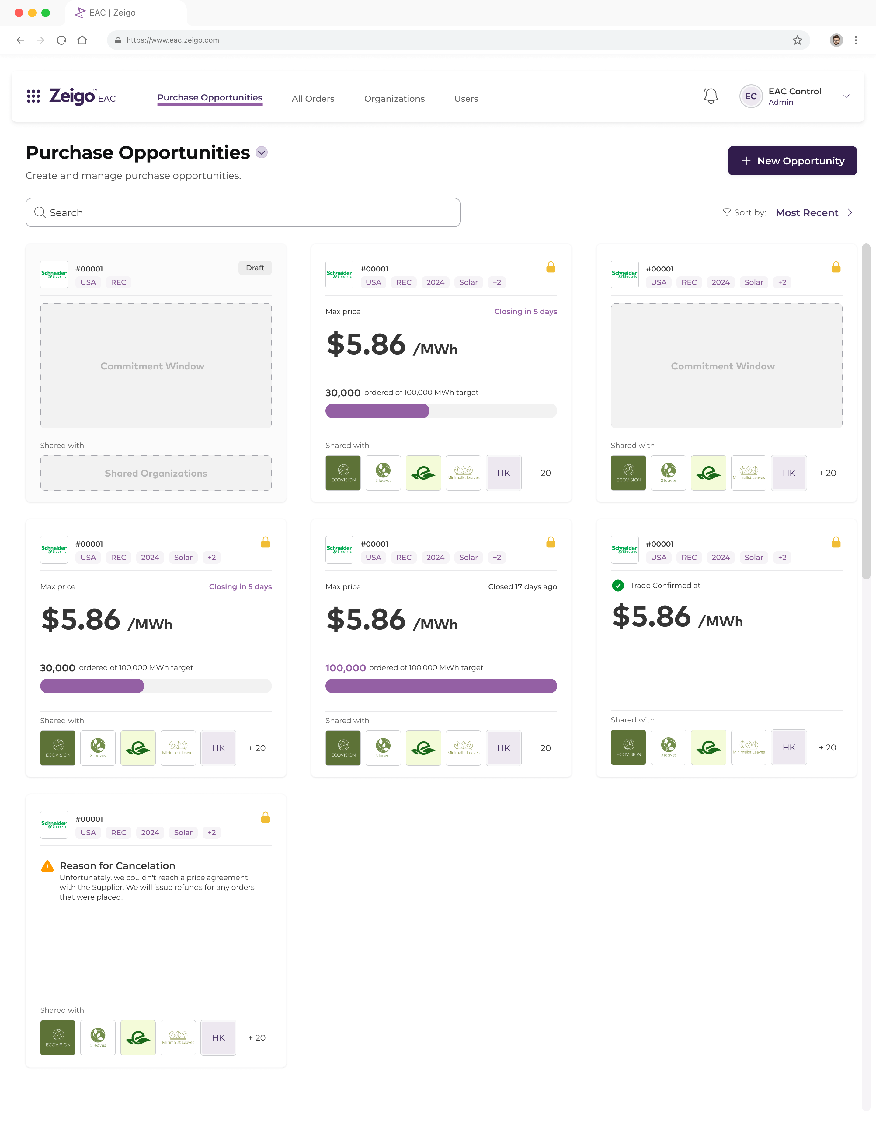
Two sides use it. **EAC Control**, the Schneider team that creates an opportunity, sets the price ceiling, shares it with organizations and closes the trade. And the **buyers**, corporate procurement teams committing volume, who see an anonymised version of the same opportunity. Before the console, the price was agreed by email and the volumes tracked by hand.
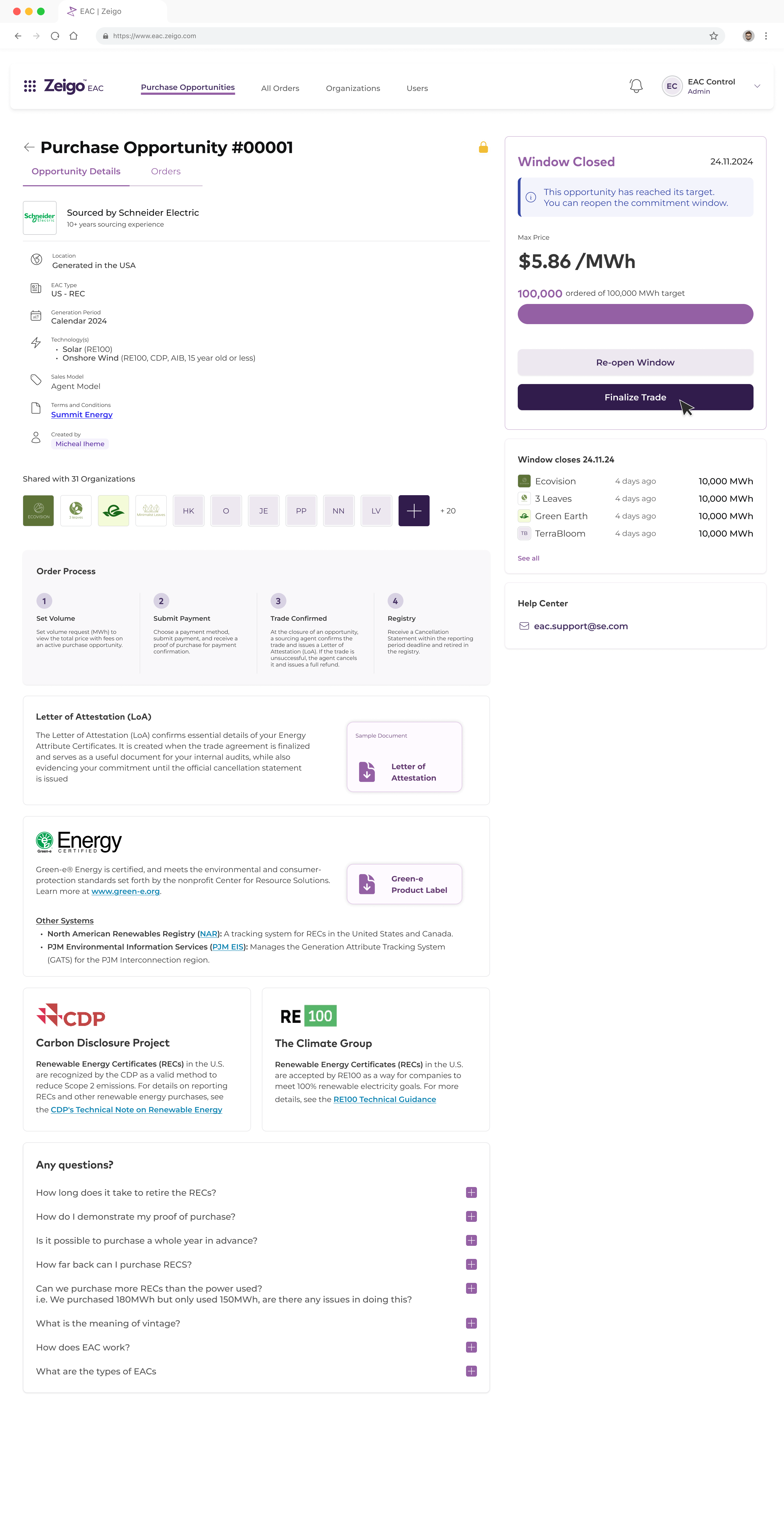
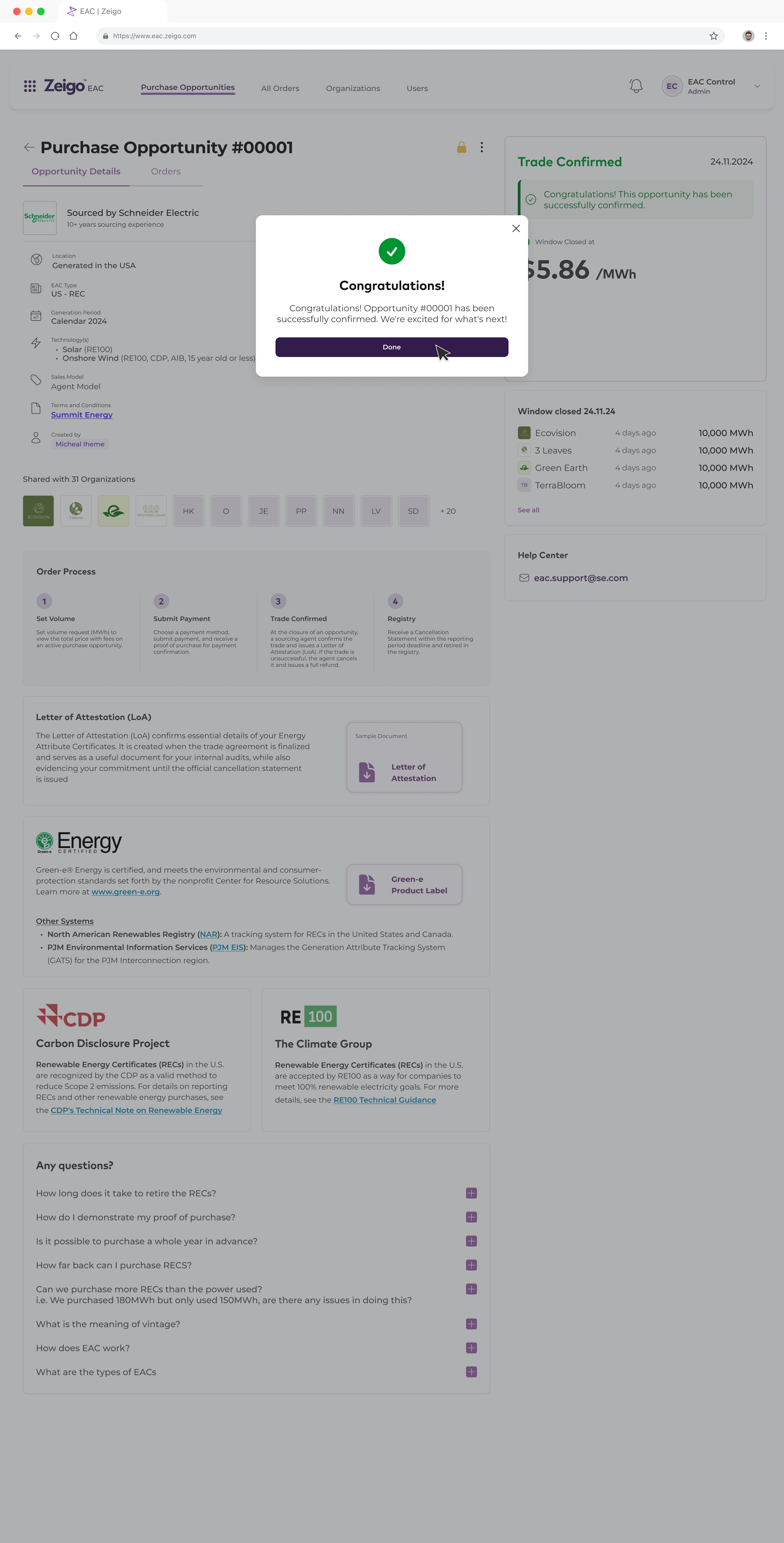
**The decision: treat the closing of the trade as the product.** Not the browsing, not the catalogue — the closing. There are six whole flows for it: confirm at the wholesale price, confirm with reconciliation, target not reached, zero orders, error, and cancellation. That is not defensive design. That is the feature.
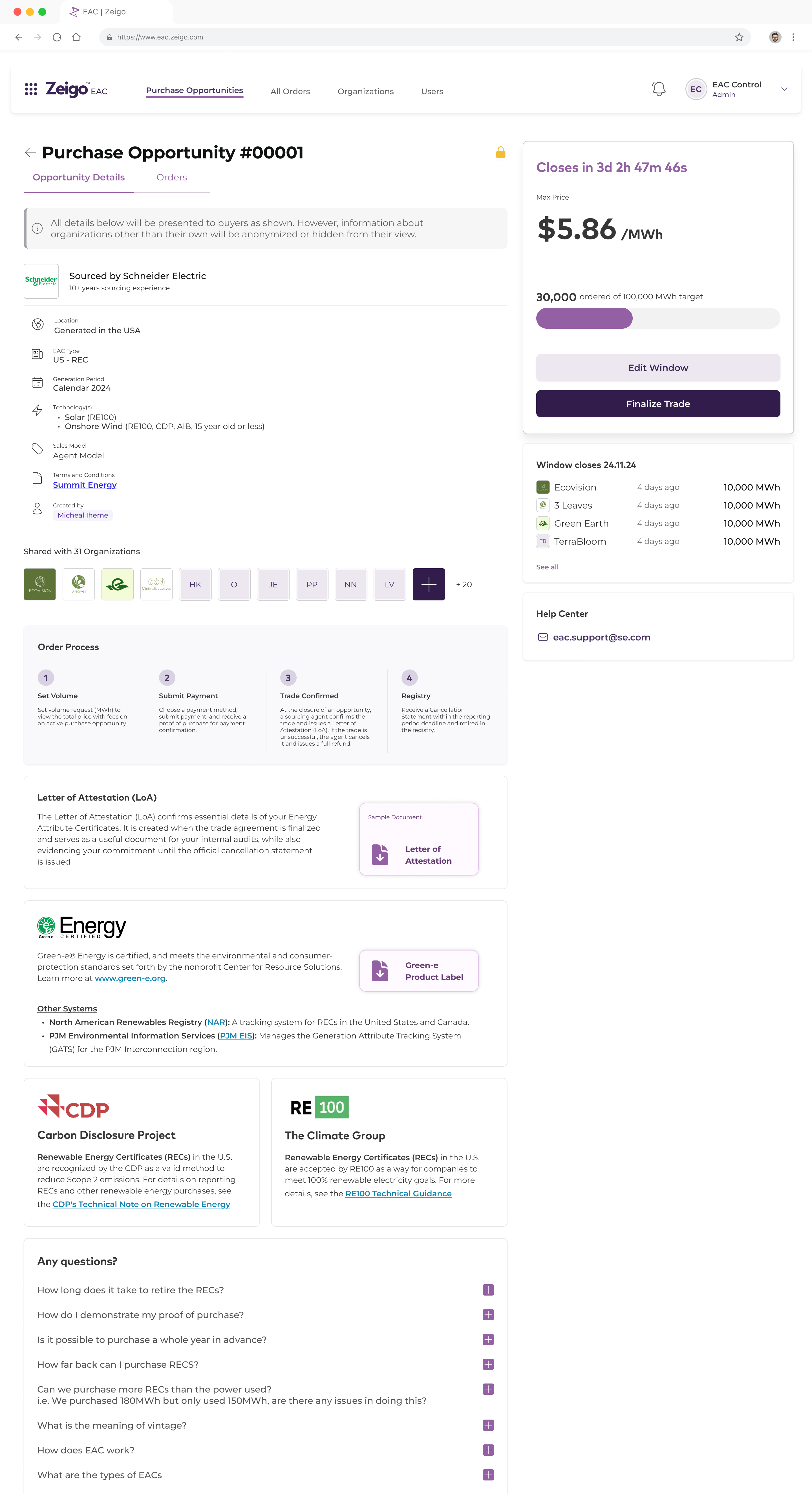
You only know there are six outcomes if you know what the system does with money. The agreed wholesale price can differ from the sum of the orders placed. A window can close under its MWh target and still be closable. A window can close with zero orders. And a cancellation means **issuing refunds to people who already paid** — which is why the buyer sees a written reason on the card, not an error code.
---
**Reconciliation is the crux, and it arrived last.** At order time the buyer pays against a wholesale commodity cost. By confirmation, the cost agreed with the supplier may be lower. So the screen asks whether it changed and lets the operator enter the final figure — constrained to be **equal to or below what the buyer already paid**, because the only legal direction for that number is one that owes the buyer money. The stack recomputes in front of them and the field answers live.
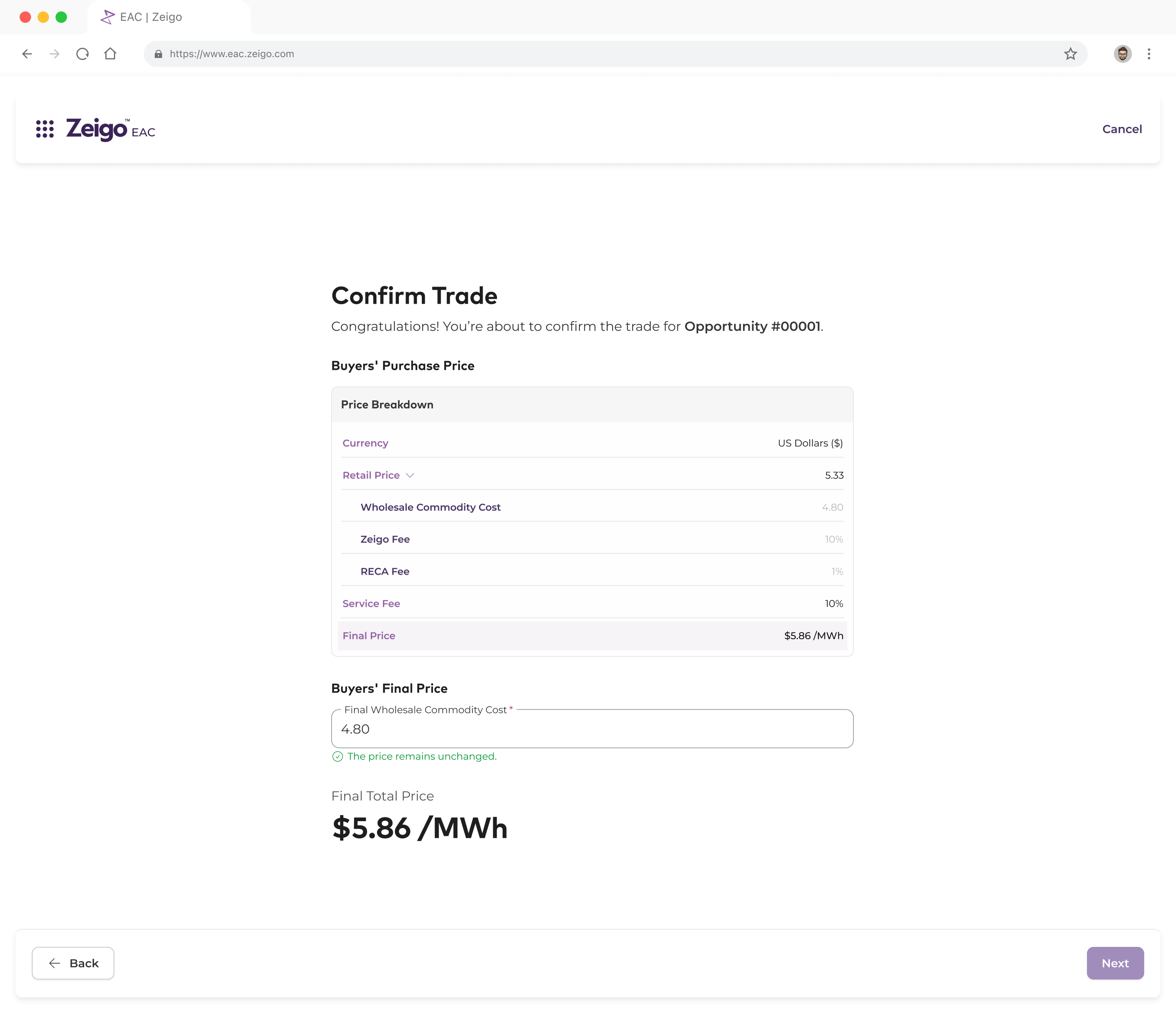
Finding it late was expensive. Reconciliation is not a screen you bolt on: it changes what the confirmation step is allowed to do, so the whole closing flow got a second version. **What I'd do differently: map the money before the screens.** Every scenario I found late was a question about what happens to a payment, not about a UI.
The method was flow first, literally. Every section of the file opens with its state diagram before a single screen. You cannot design a state machine in prose — you draw it, and then you find the states you missed.

- Time to close a window: ~2 days → <15 min
- Closing scenarios in product: 1 → 6
- Closings needing support: ~1 in 4 → ~1 in 20
**What didn't work:** the product did not reach the volume it was built for. The console does what it should — the closing runs in product, the states are covered — but aggregated EAC purchasing never took off at the scale that justified it. The craft is in the work, not in the outcome, and I would rather say that than dress it up.
### 5. Smart Production — Bayer Cropscience (Q4 2025)
[Live demo](https://smart-production-demo.vercel.app/)
Context: Production planning at Bayer Cropscience lived in an **Excel spreadsheet fed by SAP queries**: no visual way to see the production line, and every adjustment meant recalculating by hand.
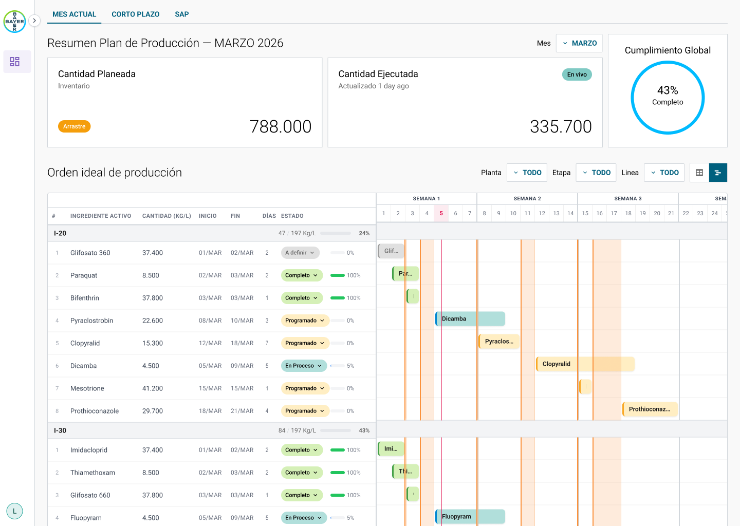
My role: We turned that workflow into a **visual production planner**: an interactive **Gantt chart** where planners can consult and modify the production line based on **required materials and current demand**, simulating changes before committing them.
Impact: Planning moved from spreadsheets and SAP lookups into **one visual system**, so the ideal production schedule can be reviewed and adjusted in minutes instead of rebuilt by hand.
A planner at Bayer Cropscience rebuilt the production schedule by hand every time demand moved. Now they drag a bar on a Gantt, see what breaks, and confirm. **A day of recalculating became twenty minutes.**
Before: 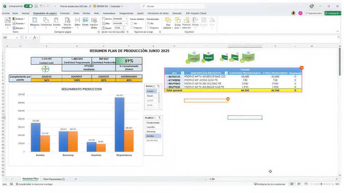
After: 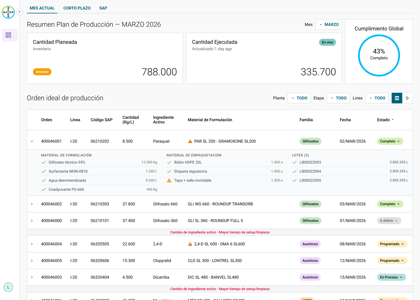
Planning lived in three workbooks. **Programación Planta** listed every material per line with a hand-colored status: Cumplido, En Proceso, Programado. **Resumen Plan** pulled totals into a bar chart and a single number, 59% global compliance. And a preliminary plan for the next month, 120 rows deep, with quantities pasted from SAP queries. SAP had the truth about materials and orders; Excel had the plan; the planner was the integration layer between them.
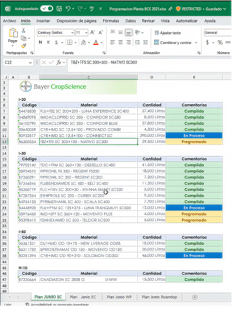
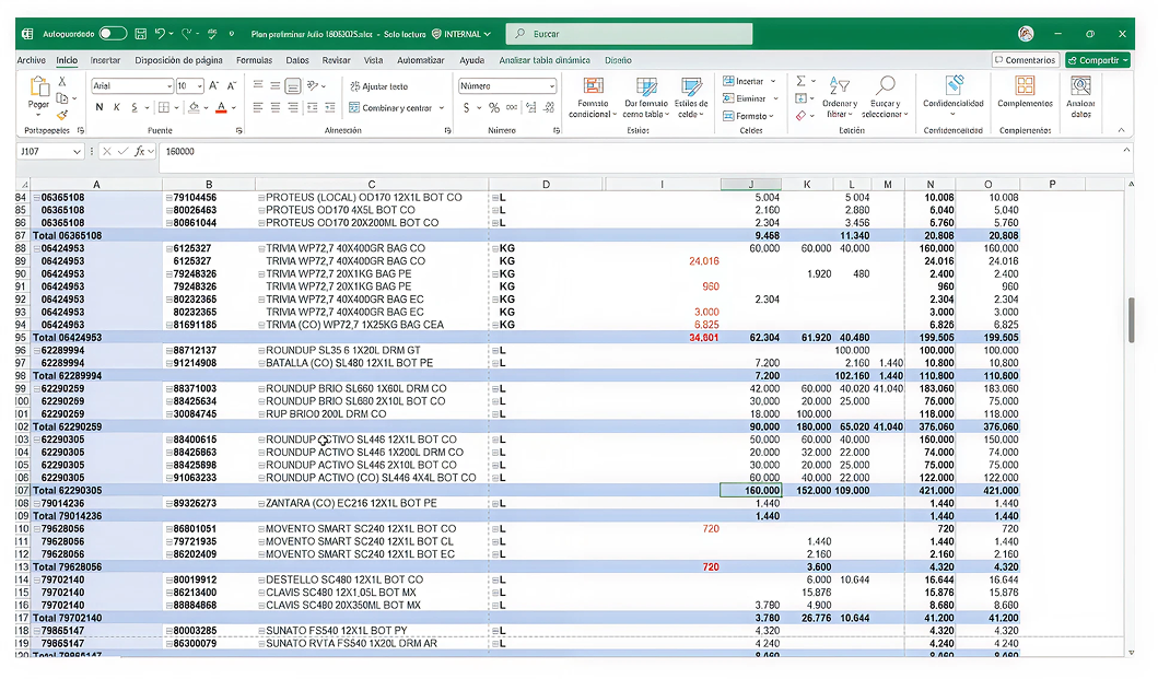
Nobody could see the line. You could see quantities and colors, but not time: which order runs when, what it blocks, what a delay pushes. So every question from the plant became a phone call to planning, and every answer meant re-running the queries and rebuilding the sheet.
---
The decision that shaped the tool was to treat the schedule as **a simulation first and a plan second**. Every drag, split or reorder happens on a draft. The Gantt recomputes required materials and flags shortages immediately, but nothing is written until the planner confirms. A planner alone would have asked for a faster spreadsheet. An engineer alone would have written the change straight through. The draft layer is what made people trust it.
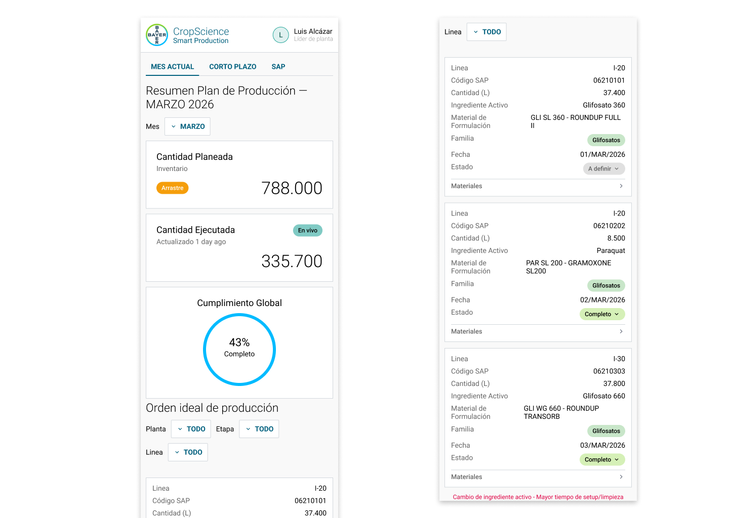
I designed and built it as a working prototype in code rather than a Figma deck, wired to the same material codes the spreadsheets used. Planners tested it on their own scenarios in the first week. That is where the shortage flags and the review-before-commit view came from; neither was on the original list.
- Rebuilding the plan after a demand change: 1 day → 20 min
- Tools a planner works in (SAP, Excel, email): 3 → 1
- Scenarios simulated before committing: 0 → Any
- Manual recalculations per adjustment: Every one → 0
What I'd do differently: bring a materials expert into the first week. The materials logic was the part I iterated on most, and half of those iterations were things a planner already knew.
### 6. Bigger Pockets — Bigger Pockets (Q2 2025)
[Website](https://www.biggerpockets.com/)
Context: **Retention** was slipping and deals were **hard to find**: members had no easy way to surface offers that were relevant to them.
My role: We **embedded interactive experiences directly in the feed**, so members could engage with potential property deals and discover markets they didn't know yet, and we carved a **freemium tier** out of the best features to lower the barrier to entry. Getting there took a lot of **A/B testing**: the volume of users on the platform let us map where their interest actually was and **where they dropped off**, so the approach came out of evidence rather than guesswork. I contributed to the design and to building several of the components, which kept the rollout fast and consistent.
Impact: Giving the plans better visibility and cutting the friction to get started brought free-to-Pro conversion to **roughly one in three members**.
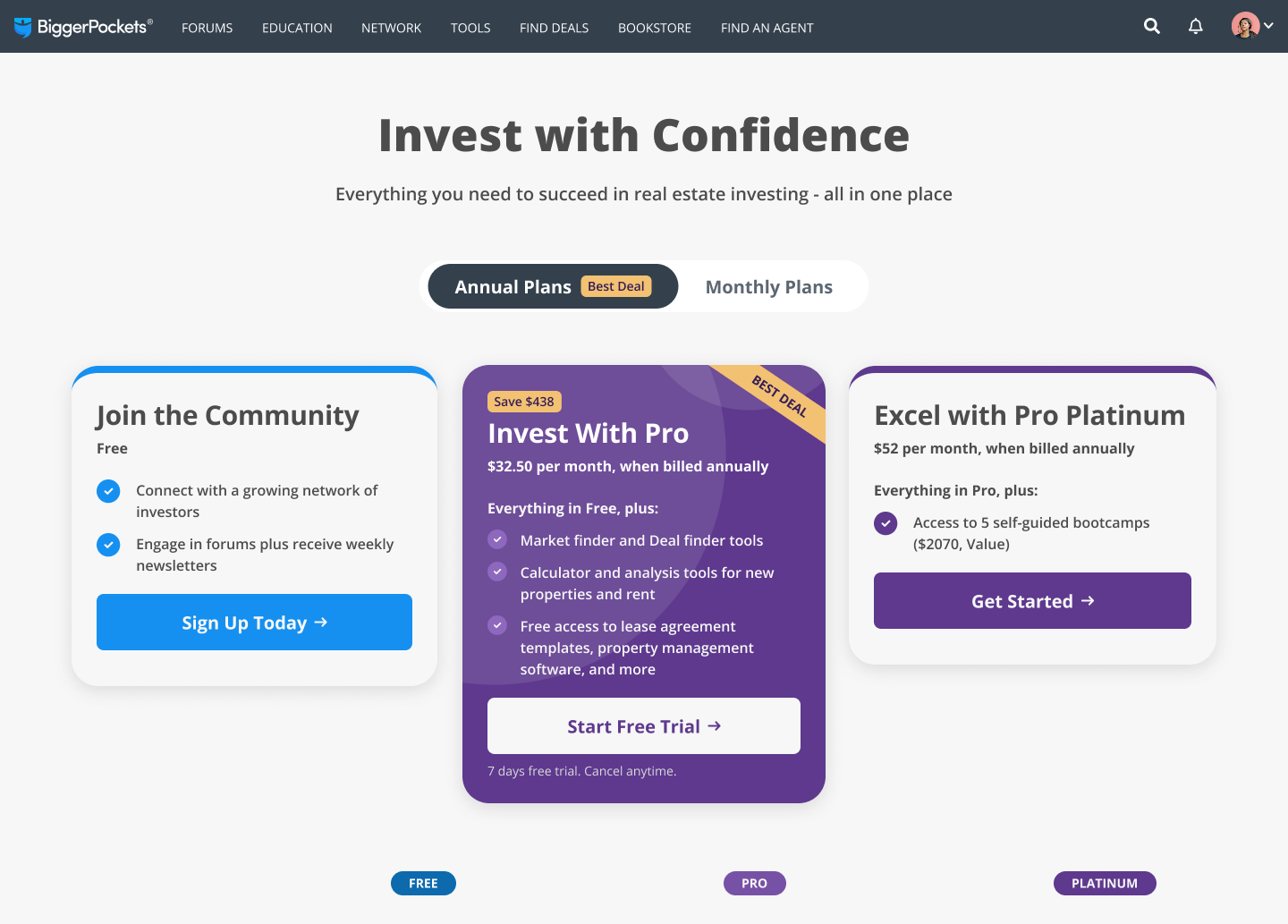
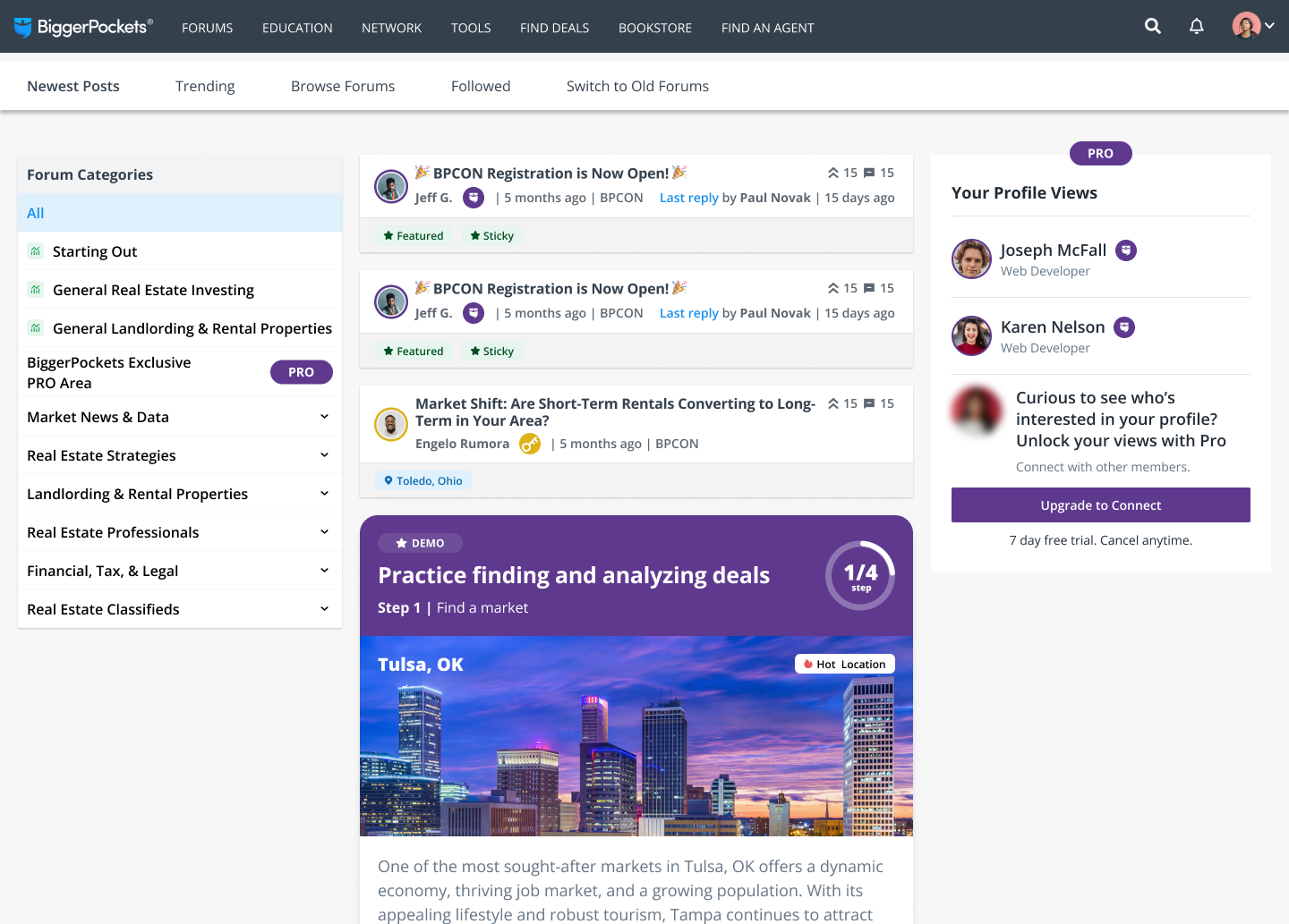
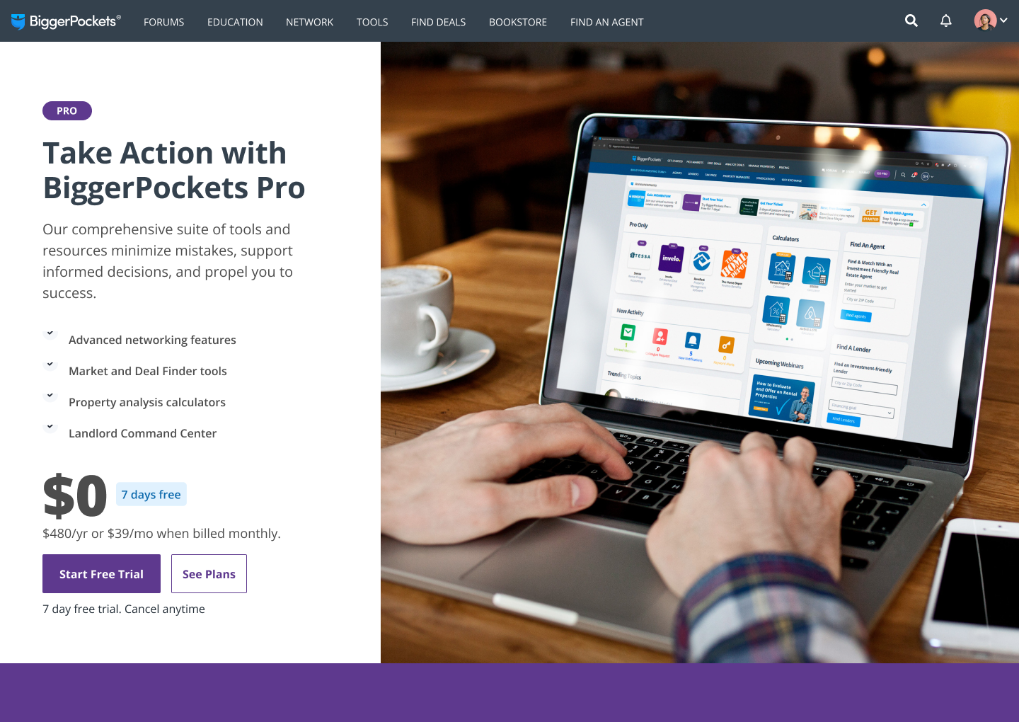
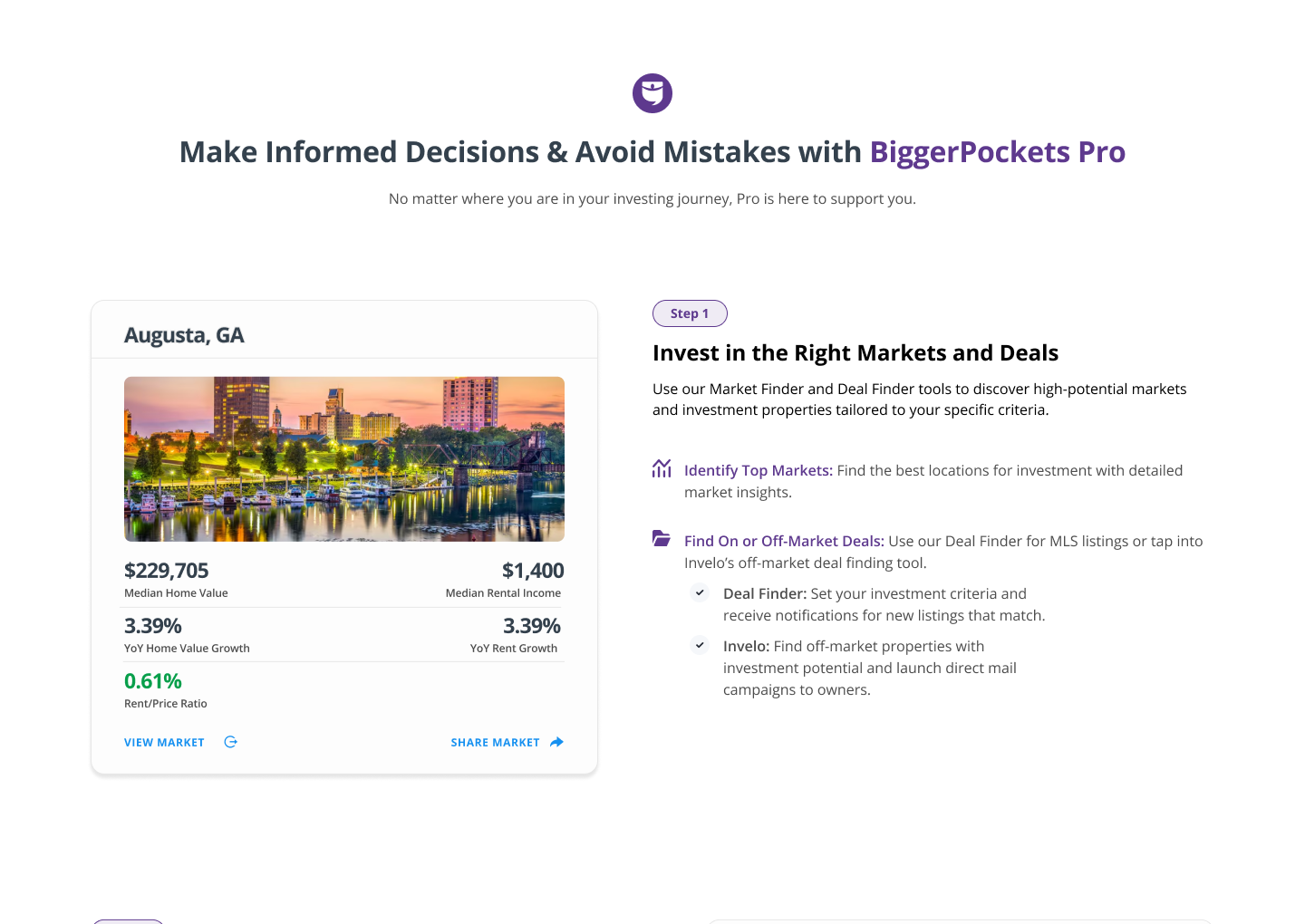
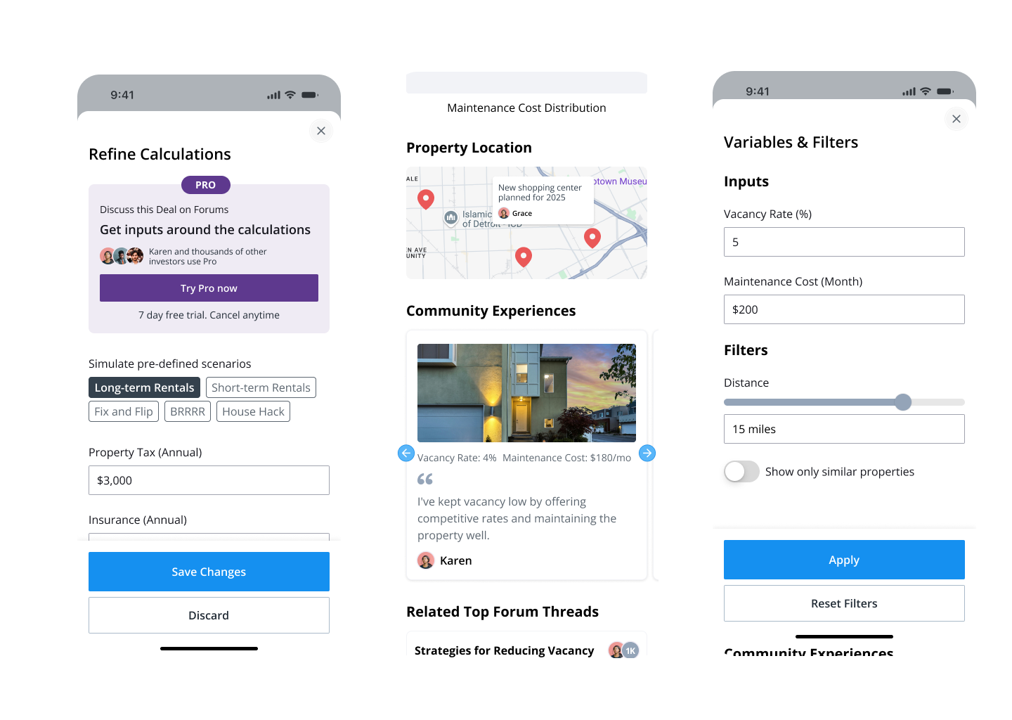
Bigger Pockets has the largest real estate investing community online, and it had a retention problem: members came for the forum and never found the deals. We put the deals in the feed and carved out a freemium tier. **Free-to-Pro conversion went from about one in five to one in three.**
- Before: A feed of forum posts. Deals lived in a separate tool most members never opened, and the only way in was a single Pro plan.
- After: Interactive deal cards inside the feed, markets you can explore in place, and a free tier built from the features people actually used.
The volume of the platform made this a measurement project as much as a design one. We could see in the funnel where members stopped: they read, they replied, they never crossed into the tools that make the subscription worth paying for. The gap between the community and the product was the whole problem.
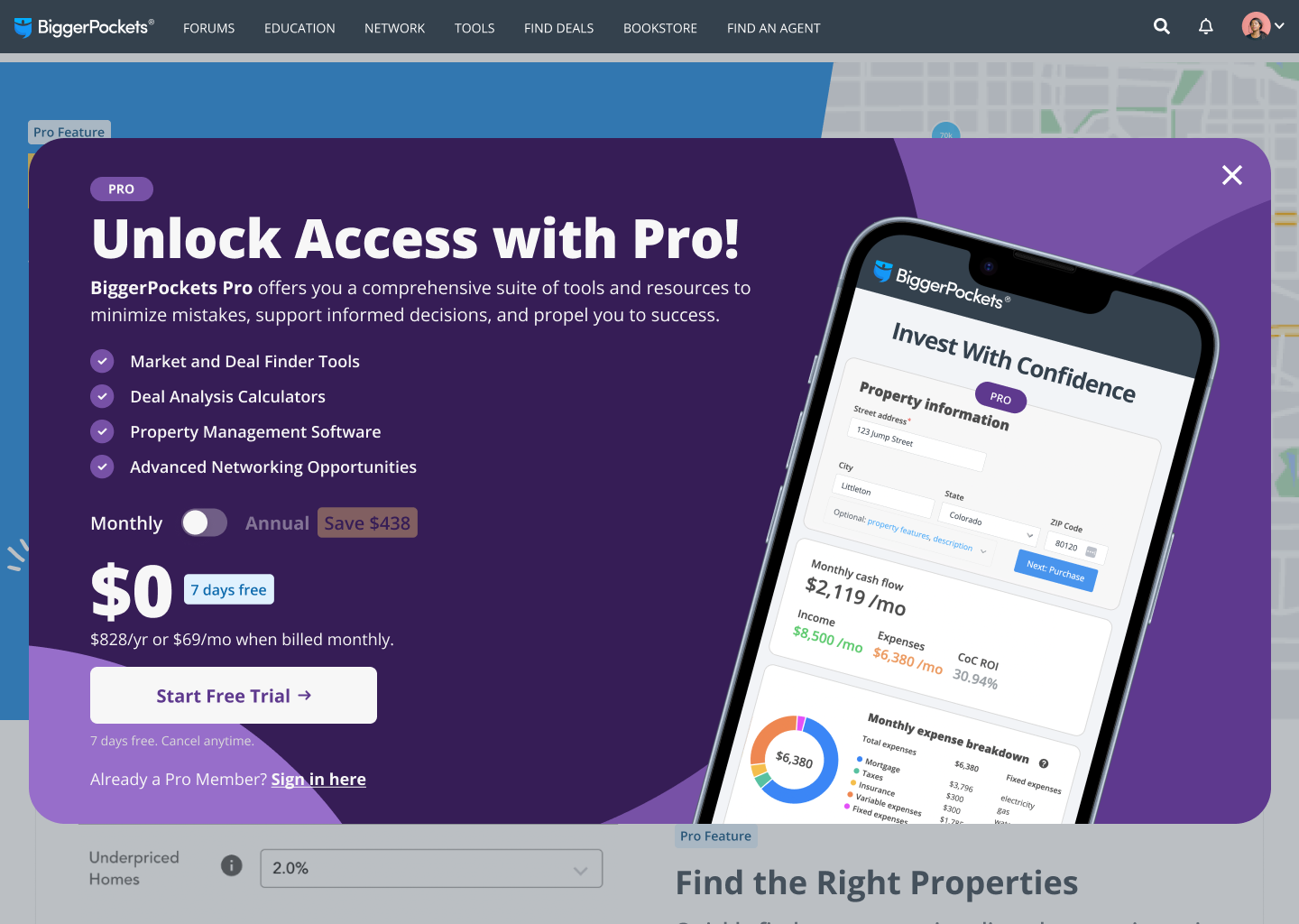
The decision was to stop sending members somewhere else. Instead of a link to the deal finder, **the deal itself renders in the feed**: numbers, market, a quick calculator you can touch. Discovering a market you didn't know became a scroll, not a search. I designed the cards and built several of the components, so the design and the A/B variants came out of the same code.
---
Freemium came out of the same data. We looked at which features correlated with members staying, moved a slice of them into a free tier, and put the plan comparison where the drop-off was. **Twelve variants later**, the version that shipped was the one that showed the plans early and asked for the card late.
- Free-to-Pro conversion: 21% → 33%
- Members interacting with a deal in the feed: 0 → 40%
- Time to a first relevant deal: 6 min → < 1 min
- A/B variants shipped to get there: — → 12
What I'd do differently: instrument the deal cards before shipping the first variant. We lost two weeks of learning because the first release measured clicks, not which numbers people actually expanded.
### 7. Mobile App BP — Bigger Pockets (Q3 2025)
[App Store](https://apps.apple.com/us/app/biggerpockets/id6736392302)
Context: The app was stuck on an **older version** that had fallen behind the web experience, and most members simply never moved over to it.
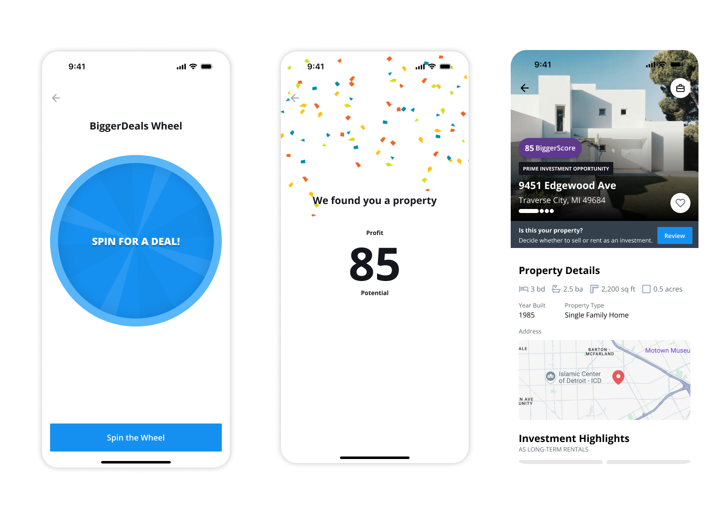
My role: We **redesigned the app end to end**, adding gamified moments like a **wheel-of-fortune easter egg** to create new reasons to come back. I contributed from design and built the **design system** behind it.
Impact: A cleaner experience with findability that actually works turned a large share of **web-only members into active mobile users**.
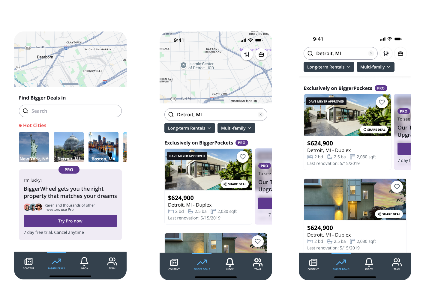
Bigger Pockets' app had fallen behind the web and most members never installed it. We redesigned it end to end on a new design system. **One in three web-only members now uses the app**, up from one in ten.
- Before: An older app behind the web experience: search that didn't find things, features missing, and no reason to open it instead of the browser.
- After: A full redesign on one design system, search that finds deals and people, and gamified moments that give members a reason to come back.
The brief was a rewrite, but the real problem was habit. Members had years of muscle memory on the website and nothing in the app rewarded switching. So the redesign had two jobs: match the web on the things people did every day, and add things the web could not do.
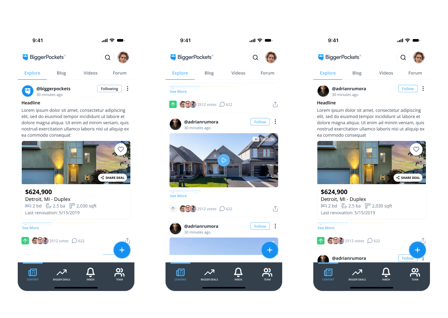
I contributed from design and built the **design system** the app runs on: tokens, typography, components, so every screen came out of the same kit. That is what made the rewrite fast. Once the kit existed, screens were assembly, and the team could ship the whole app instead of a first half.
---
The gamified moments were the part people talk about. A **wheel-of-fortune easter egg**, unlocked by actions in the app and not on the web, turned into the most shared screen of the launch. It is a small thing, but it gave the app an identity of its own.
- Web-only members who became mobile users: 1 in 10 → 1 in 3
- Day-7 retention: 18% → 31%
- Screens built from the design system: 0 → 100%
- Components in the design system: 0 → 60
What I'd do differently: ship the design system tokens to the web team at the same time. The two products drifted for a quarter before we aligned them.
---
## Contact
- LinkedIn: https://www.linkedin.com/in/exequiel-lobaiza/
- GitHub: https://github.com/exelobaiza Zeigo HUBQ1 2026Para Schneider Electric
 Zeus Design System2022 → 2026Para Schneider Electric
 Zeigo Activate2024 → 2025Para Schneider Electric
 Zeigo Power2025Para Schneider Electric
 Smart ProductionQ4 2025Para Bayer Cropscience
 Bigger PocketsQ2 2025Para Bigger Pockets
 Mobile App BPQ3 2025Para Bigger Pockets